Built by Agents, Used by Agents: Vercel's UI SDK and Headless UI in the Age of AI
UI SDK is a headless UI library from Vercel Labs with framework-agnostic keyboard, focus, and ARIA behaviors. It treats AI agents as both builders and users of UI. Claude Code builds a transfer list that an agent then drives via the agent bridge.
Headless UI libraries such as Radix Primitives and
React Aria ship without styles, and in return they provide behaviors like keyboard interaction, focus management, and ARIA attributes. Developers don't have to implement the complex accessibility of menus and dialogs themselves, and they only need to adapt the look to their own design system.
That benefit, however, only applies when you use the components the library provides. A kanban board or a picker tailored to a specific business task, for example, isn't included in typical headless UI libraries. With the rise of coding agents, agents now build these missing components directly. They can generate such components quickly, but because they can't reuse the behaviors built into finished components, they end up writing focus destinations, arrow-key handling, and screen reader announcements from scratch every time, and small mistakes tend to creep in.
At the same time, finished UIs are increasingly operated by agents rather than humans. An agent reads the DOM's accessibility tree to understand what a component means, but the DOM tree doesn't tell it what the component can do. As a result, the agent has to operate the UI by reproducing the same clicks and key presses a human would. In other words, UIs designed for humans are hard for agents to work with.
Consider choosing a prefecture from a custom-built select box. The agent clicks the select box, waits for the list of options to open, reads the accessibility tree again to find the options, and then clicks the one it wants. Because it calls a tool and rereads the page for every action, picking a single value takes several round trips, each costing time and tokens.
If the select box itself exposed "the list of available options" and "an operation to set the value" to the agent, the agent could set the value in a single call by specifying the option. Letting agents operate components directly in terms of their meaning, instead of making them reproduce human input, is what makes a UI easy for agents to use.
UI SDK, which Vercel Labs released as a beta on November 12, 2026, is a headless UI library designed around these two shifts.
In this article, I'll outline how UI SDK is structured and how it differs from existing headless UI libraries, then have Claude Code build a transfer list with UI SDK and let an agent operate that component.
As of November 13, 2026, UI SDK is in beta (@ui-sdk/[email protected]). The API, documentation, and behavior may change before the stable release.
What Makes UI SDK Different
UI SDK describes itself not as a component library but as the layer beneath one. The repository's AGENTS.md puts it this way:
It isn't a component library. It's the layer underneath one: …
That underlying layer consists of behaviors. A behavior is a function that handles a single job a UI performs, such as "move focus with the arrow keys," "jump to the matching option as you type," or "open a popup next to a button and return focus when it closes." These are provided by @ui-sdk/core as createRovingFocus, createTypeahead, and createPopup, respectively. There are more than 50 behaviors, and you can combine them to build complex components.
UI SDK also provides more than 50 components built from the same behaviors, such as Select and Date Picker, but what sets it apart is that it assumes you'll assemble components the library doesn't have from behaviors. Where UI SDK differs from existing libraries is that it builds AI agents into its design in the following two roles:
- Component builder: the agent assembles components the library doesn't have from behaviors
- UI user: the agent reads and writes the components on a finished screen in terms of state and actions
Behaviors and Primitives
To build a component with UI SDK, you define a primitive with definePrimitive. A primitive is a definition that bundles a single component's state (state), operations (api), and parts (slots), which are the units of DOM elements. Behaviors are created inside api and wired to the parts' attributes and events.
Primitives don't depend on any framework. When you pass one to the createParts function provided by each framework's adapter, you get components such as Root and Input in React. Parts have no styles and expose their state as data-* attributes and CSS variables.
UI SDK's README explains that primitives are meant to be written by agents rather than by hand.
Don't worry, you don't need to learn how to write this. Your agents will.
Having an Agent Build a Transfer List
Let's build a transfer list with UI SDK. A transfer list is a component for moving items between two lists, left and right, and it needs to properly implement behaviors such as arrow-key navigation, multiple selection, where focus goes after a move, and screen reader announcements.
Setup
In a project created from Vite's React template, install UI SDK's core and its React adapter. The React adapter requires React 19 or later.
npm install @ui-sdk/[email protected] @ui-sdk/[email protected]UI SDK distributes an official skill called ui-sdk. Add it to your project with the skills CLI.
npx skills add vercel-labs/ui --skill ui-sdkThe same skill is also bundled at node_modules/@ui-sdk/core/skills/ui-sdk/SKILL.md.
The Prompt
The official documentation recommends describing concretely what people should be able to do with the component you want to build. Following that advice, I wrote the prompt below.
Use the ui-sdk skill to build a transfer list in React.

It's a component with two lists, "Unassigned" on the left and "Assigned" on the right, that lets you move project members between them.

- Each list takes focus only once with Tab, and the up and down arrow keys move between items
- Space selects and deselects an item, and multiple items can be selected
- "Assign" and "Remove" buttons between the two lists move the selected items to the other list
- Don't lose focus after a move. If items remain in the source list, return focus to that list
- Announce the number of moved items to screen readers
- The parent component owns the assigned value and can receive changes
- An agent can assign and remove members through createAgent

Start with six fixed members and a single example page. Minimal styling is fine.

Test keyboard interaction, focus, and ARIA, and run the typecheck and relevant tests. Don't start the dev server. At the end, report the commands you ran, their results, and anything you couldn't verify.
I had Claude Code work from this prompt. The run log shows that, as the skill instructs, the agent read llms.txt, the relevant sections of core.md, and the type definitions before starting the implementation. It created the following files:
src/transfer-list/primitive.ts: the transfer list primitivesrc/transfer-list/transfer-list.tsx: a React wrappersrc/transfer-list/transfer-list.test.tsx: Vitest testssrc/agent.ts: a module that creates the bridge withcreateAgent()src/App.tsx,src/members.ts: an example page
Reading the Generated Primitive
At the heart of src/transfer-list/primitive.ts is a single call to definePrimitive. Let's look at its overall structure first.
import {
  announce,
  createChange,
  createFocusRecovery,
  createRovingFocus,
  createSelection,
  definePrimitive,
  type ChangeDetails,
} from "@ui-sdk/core";

// Types (TransferListOptions, TransferListState, etc.) and helper functions are omitted

const transferList = definePrimitive({
  // The component's name. The snapshot's component field also uses this name
  name: "transfer-list",
  // The options the component accepts, and their kinds
  options: {
    items: "value",
    value: "list",
    defaultValue: "list",
    onValueChange: "callback",
  },
  // State the parent can control with value, defaultValue, and onValueChange
  controlled: ["value"],
  // The initial state
  state: (options: TransferListOptions): TransferListState => ({
    items: options.items ?? [],
    value: options.value ?? options.defaultValue ?? [],
    selected: [],
    focusedAvailable: null,
    focusedAssigned: null,
  }),
  // Reflects the controlled value into state whenever options change (omitted)
  sync: (options) => ({ /* ... */ }),
  // The component's operations. Behaviors are created here
  api: (context) => { /* ... */ },
  // The parts, which are the units of DOM elements
  slots: (slot) => { /* ... */ },
  // The operations exposed to agents
  agent: { actions: ["assign", "unassign"], items: (api) => api.items() },
});options, state, api, and slots correspond to the building blocks of a primitive described in the previous section. From here, let's look inside api, slots, and agent in turn.
api: Combining Behaviors
In api, the agent combined the following behaviors and functions, all provided by @ui-sdk/core:
createSelection: manages multiple-selection statecreateRovingFocus: gives each list a single Tab stop and moves focus between items with the arrow keyscreateFocusRecovery: moves focus to a replacement element when the focused item disappearsannounce: puts a sentence into a live region for screen readers to read aloudcreateChange: reports value changes toonValueChangeand lets the parent cancel them
Here's the whole api:
api: (context) => {
  const { store } = context;
  const change = createChange(context);
  const selection = createSelection(context, {
    key: "selected",
    multiple: () => true,
    // set and order are omitted
  });

  // Create focus movement and recovery behaviors for each of the two lists
  const block = (side: Side) => ({
    roving: createRovingFocus<TransferListState, OptionProps>(context, {
      slot: optionSlot[side], // "availableOption" or "assignedOption"
      key: focusKey[side], // "focusedAvailable" or "focusedAssigned"
    }),
    recovery: createFocusRecovery<OptionProps>({
      fallback: (lost) => {
        // Returns the item in the same list closest to the one that disappeared (omitted)
      },
    }),
  });
  const blocks = {
    available: block("available"),
    assigned: block("assigned"),
  };

  const move = (to: Side, requested: string[] | undefined, event?: Event) => {
    // Shown below
  };

  return {
    selection,
    blocks,
    assign: (ids?: string[], event?: Event) => move("assigned", ids, event),
    unassign: (ids?: string[], event?: Event) => move("available", ids, event),
    items: () =>
      store.get().items.map((item) => ({ value: item.id, label: item.label })),
  };
},
Since the left and right lists share the same behavior, a function called block creates the same set of behaviors twice. The slot passed to createRovingFocus is the name of the part that focus moves between. key is the state key that stores which item has focus.
The object that api returns becomes the component's operations. blocks and selection are referenced from slots, covered below, while assign, unassign, and items are referenced from the agent key.
In the second half of the move function, which assign and unassign call, the code calls change and only announces the count and moves focus if the parent didn't cancel the change.
const move = (to: Side, requested: string[] | undefined, event?: Event) => {
  // Work out the source list (from), the ids of the items to move (ids),
  // and the assigned value after the move (value) (omitted)

  if (
    !change("value", value, {
      reason: to === "assigned" ? "assign" : "unassign",
      event,
    })
  ) {
    return false;
  }

  store.set({ selected: state.selected.filter((id) => !moved.has(id)) });
  announce(
    to === "assigned"
      ? `${ids.length} 人を割り当てました`
      : `${ids.length} 人を外しました`,
  );

  // Of the items left in the source list, the one closest to the moved item
  const stay = nearest(
    state.items.map((item) => item.id),
    (id) => pool.includes(id) && !moved.has(id),
    ids[0],
  );
  const target = stay
    ? { side: from, key: stay }
    : { side: to, key: ids[0] };
  blocks[target.side].roving.focus(target.key);
  return true;
};
The reason in the third argument to change is a string describing why the change happened. The parent receives the reason through details.reason in onValueChange(value, details), and where the change came from (keyboard, mouse, agent, and so on) through details.source. If items remain in the source list, focus moves to the closest one; otherwise, it moves to the destination list.
slots: Defining the Parts
slots defines parts with the slot function and returns them. In each item's part, attrs computes ARIA attributes from state, and bind connects the element to the behaviors.
slots: (slot) => {
  const option = (side: Side) =>
    slot<OptionProps>({
      role: "option",
      focus: "roving",
      props: { value: "string" },
      attrs: (state, part) => ({
        tabindex: part.api.blocks[side].roving.tabIndex(state, part),
        "aria-selected": String(state.selected.includes(part.key)),
        "data-selected": state.selected.includes(part.key) ? "" : undefined,
      }),
      // press, on.keydown, and bind are omitted
    });
  // The list (listbox) and move button (button) parts are defined the same way (omitted)

  return {
    root: slot({ role: "group" }),
    available: list(),
    availableOption: option("available"),
    assigned: list(),
    assignedOption: option("assigned"),
    assign: mover("assigned"),
    unassign: mover("available"),
  };
},
attrs reaches the blocks returned by api through part.api. The keys of the returned object (root, availableOption, and so on) become the part names as-is.
agent: Operations Exposed to Agents
The agent key at the end of definePrimitive declares the API exposed to agents. actions lists the names of operations an agent can call, and items is a function that returns the list of items an agent can retrieve.
agent: { actions: ["assign", "unassign"], items: (api) => api.items() },The assign and unassign in actions are the methods of the same names returned by api. The api argument to items is also the object returned by api. How an agent operates the component is covered in a later section.
The React Wrapper
The React wrapper passes the primitive and the element name for each part to createParts.
import { createParts } from "@ui-sdk/react/primitive";
import { transferList } from "./primitive";

const parts = createParts(transferList, {
  root: "div",
  available: "ul",
  availableOption: "li",
  assigned: "ul",
  assignedOption: "li",
  assign: "button",
  unassign: "button",
});
This gives you components such as parts.Root, parts.Available, and parts.AvailableOption. The TransferList component in the same file lays out headings and the member lists using these parts.
import { useId } from "react";
import {
  listOf,
  type TransferItem,
  type TransferListOptions,
} from "./primitive";

type TransferListProps = {
  label: string;
  items: TransferItem[];
  value: string[];
  onValueChange: NonNullable<TransferListOptions["onValueChange"]>;
};

function TransferList({
  label,
  items,
  value,
  onValueChange,
}: TransferListProps) {
  const id = useId();
  const state = {
    items,
    value,
    selected: [],
    focusedAvailable: null,
    focusedAssigned: null,
  };
  // listOf is a function from primitive.ts that splits items into left and right by whether they're in value
  const available = listOf(state, "available");
  const assigned = listOf(state, "assigned");

  return (
    <parts.Root
      aria-label={label}
      items={items}
      value={value}
      onValueChange={onValueChange}
    >
      <div>
        <h3 id={`${id}-available`}>未割り当て</h3>
        <parts.Available aria-labelledby={`${id}-available`}>
          {available.map((item) => (
            <parts.AvailableOption key={item.id} value={item.id}>
              {item.label}
            </parts.AvailableOption>
          ))}
        </parts.Available>
        {available.length === 0 && <p>メンバーはいません</p>}
      </div>
      <div>
        <parts.Assign>割り当てる</parts.Assign>
        <parts.Unassign>外す</parts.Unassign>
      </div>
      <div>
        <h3 id={`${id}-assigned`}>割り当て済み</h3>
        <parts.Assigned aria-labelledby={`${id}-assigned`}>
          {assigned.map((item) => (
            <parts.AssignedOption key={item.id} value={item.id}>
              {item.label}
            </parts.AssignedOption>
          ))}
        </parts.Assigned>
        {assigned.length === 0 && <p>メンバーはいません</p>}
      </div>
    </parts.Root>
  );
}

export { TransferList, type TransferListProps };
When passed to parts.Root, items, value, and onValueChange become the primitive's options, while HTML attributes such as aria-label are applied to the element as-is. Each item part receives the same id for both key and value, and the primitive uses that value as part.key to compute selection state and ARIA attributes. Because the parts own keyboard interaction, selection, and ARIA attributes, the wrapper only has to lay out the markup.
Finally, App.tsx uses the TransferList component like this:
import { useState } from "react";
import { members } from "./members";
import { TransferList } from "./transfer-list/transfer-list";

function App() {
  const [assigned, setAssigned] = useState<string[]>(["aiko"]);

  return (
    <main>
      <h1>プロジェクトメンバー</h1>
      <TransferList
        label="プロジェクトメンバーの割り当て"
        items={members}
        value={assigned}
        onValueChange={setAssigned}
      />
      <p>
        割り当て済み:{" "}
        {members
          .filter((member) => assigned.includes(member.id))
          .map((member) => member.label)
          .join("、") || "なし"}
      </p>
    </main>
  );
}

export default App;
Trying It in the Browser
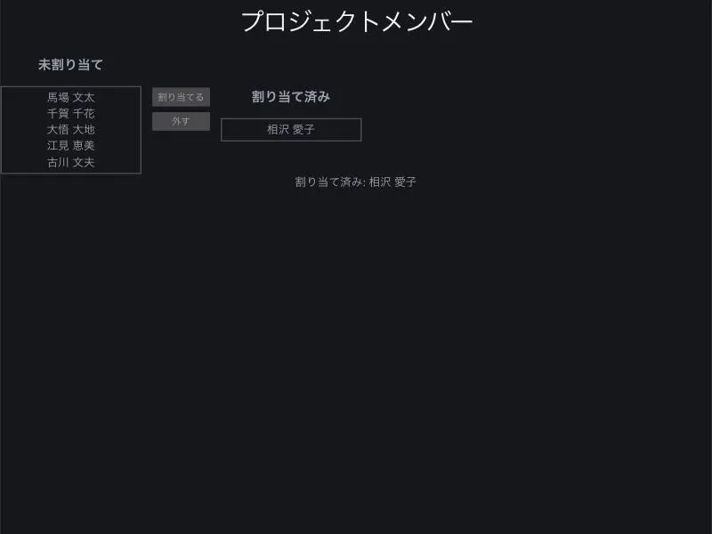
Start the dev server and the following transfer list appears. Member lists sit in the "Unassigned" (未割り当て) list on the left and the "Assigned" (割り当て済み) list on the right, with "Assign" (割り当てる) and "Remove" (外す) buttons between the two lists.
This transfer list supports the following keyboard interactions:
- Tab moves focus into each list, and the up and down arrow keys move between items within a list
- Space selects and deselects an item. You can select multiple items, and selected items get
aria-selected="true" - The "Assign" and "Remove" buttons move the selected items to the other list
- After a move, if items remain in the source list, focus moves to the closest one. Otherwise, focus moves to the destination list
- The number of moved items is announced to screen readers through a live region with
aria-live="polite"
I confirmed that items moved between the lists as expected.
Letting an Agent Operate the UI
Next, let's have an agent operate the finished screen. To make UIs easy for agents to operate, UI SDK provides a mechanism called the agent bridge. The agent bridge is an object that mediates between the UI SDK components on a page and an AI agent, and you create it with createAgent. The bridge has the following three methods, each of which can be used directly as an agent tool:
snapshot: lists the components on the page, along with their state and the operations they acceptquery: finds components, or options such as those in a Select, by label or textact: takes a list of steps and operates the UI by calling each component's API
The bridge calls the APIs that components expose directly. This lets agents operate the UI without reading screenshots or reproducing clicks and key presses.
You can combine the bridge with the tool definitions provided by agentTools and pass them to your own agent, or use registerTools to expose them as WebMCP tools to the browser's built-in agent. In this article, I'll call the bridge from the browser console to see how it works.
Reading a Snapshot
The bridge finds created components through an internal registry, so you need to create it before the page renders. Create the bridge in src/agent.ts, and also expose it on window with Object.assign() so you can try it from the console.
import { createAgent } from "@ui-sdk/react/agent";

const agent = createAgent();

Object.assign(window, { agent });

export { agent };
In main.tsx, load this module before rendering the app. Put import "./agent" at the very top of the file so the bridge is created before any other module.
import "./agent";
import { StrictMode } from "react";
import { createRoot } from "react-dom/client";
import App from "./App.tsx";

createRoot(document.getElementById("root")!).render(
  <StrictMode>
    <App />
  </StrictMode>,
);
Calling window.agent.snapshot() in the browser console returned the following result.
[
  {
    "ref": "c1",
    "component": "transfer-list",
    "actions": ["assign", "unassign"],
    "label": "プロジェクトメンバーの割り当て",
    "value": ["aiko", "chika", "emi"],
    "items": [
      { "value": "aiko", "label": "相沢 愛子" },
      { "value": "bunta", "label": "馬場 文太" },
      // Omitted...
    ]
  }
]
actions lists assign and unassign, which were declared in the primitive's agent key. label is the component's accessible name, computed from the aria-label the wrapper passed to Root. items is the value returned by the items function in the agent key.
Running Actions
When you pass steps (steps) to agent.act(), the bridge calls the component's API. For ref, you can specify either a ref from the snapshot or a label, and a single call can run multiple steps.
await window.agent.act({
  steps: [
    { ref: "プロジェクトメンバーの割り当て", action: "assign", args: [["古川 文夫"]] },
    { ref: "プロジェクトメンバーの割り当て", action: "unassign", args: [["emi"]] },
  ],
});
Running it returned the following result.
{
  "ok": true,
  "steps": [
    {
      "step": 0,
      "ref": "c1",
      "changes": [
        {
          "component": "transfer-list",
          "label": "プロジェクトメンバーの割り当て",
          "key": "value",
          "value": ["aiko", "chika", "emi", "fumio"]
        }
      ]
    },
    // The result of the second step (unassign) is omitted
  ],
  "appeared": [],
  "values": {
    "c1 プロジェクトメンバーの割り当て": ["aiko", "chika", "fumio"]
  }
}
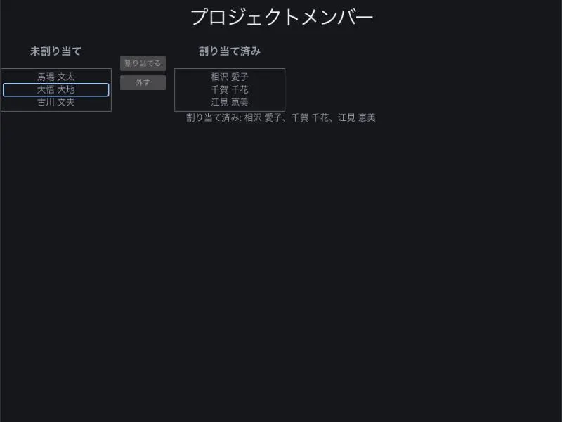
steps holds the values that changed in each step, and values holds the values after all steps have run. From this result alone, the agent can confirm its operations took effect without rereading the screen. The change was also reflected in the two lists on screen.
If you specify an operation that isn't declared in the agent key, the bridge refuses to run it and returns the operations you can use.
await window.agent.act({
  steps: [{ ref: "プロジェクトメンバーの割り当て", action: "setValue", args: [["bunta"]] }],
});
// { ok: false, error: { step: 0, message: "transfer-list c1 takes no setValue now. It takes: assign, unassign." }, ... }
Because the error message includes the available operations, the agent can read the result and fix its steps. The error message itself is written with an agent, rather than a human developer, as the reader.
Restricting Operations with Permissions
The app can place restrictions on what agents do. The first is the allow callback of createAgent, which is called before each step runs. The following bridge refuses only unassign.
import { createAgent } from "@ui-sdk/react/agent";

const agent = createAgent({
  allow: ({ component, action }) =>
    !(component === "transfer-list" && action === "unassign"),
});
Running unassign with this bridge returned ok: false and The app refused unassign on c1., and the value didn't change. Since allow can also return a Promise<boolean>, you can, for example, wait for a human's decision in a confirmation dialog.
The second is the value change callback. An agent's changes go through the same onValueChange as a human's, with details.source set to "agent". By checking details.source in an if statement and calling details.cancel(), you can refuse the agent's operation.
According to the Permissions documentation, you can also apply the following controls with HTML attributes:
data-agent-confirm="<description>": treats operations on the element and its descendants as requiring human approval, regardless of whatallowdecides. Withoutallow, the operation fails and the agent receives a message telling it to ask a human to do it. Withallow, the description arrives asstep.confirm, so the app can show its own confirmation UI and return the human's answer. The description is also included in the snapshot, so the agent knows before acting that approval is requireddata-agent-hidden: hides components within its scope from the agentdata-agent-secret: returns the value replaced with"[redacted]". Password, card number, and one-time code fields are hidden automatically, even without the attribute
Summary
- UI SDK is a headless UI library that provides behaviors such as keyboard interaction, focus, selection, and popups, and supports React, Vue, Svelte, Solid, and Web Components
- What sets UI SDK apart from existing headless UI libraries is that it builds agents into its design as both "component builders" and "UI users"
- You define a component by bundling its state, API, and parts with
definePrimitive, then turn it into framework components withcreateParts createAgent'ssnapshotreturns the operations the component author declared in theagentkey, andactcalls those operations- Agent operations can be refused up front with
allow, or per change withdetails.source === "agent"inonValueChange