TanStack Charts: The Design Behind the New Charting Library, and How to Use It
With so many charting libraries available, why was TanStack Charts built? We look at the style it inherited from Observable Plot and its focus on living inside an application, then overlay event annotations on a revenue line chart in React.
There are already many libraries for displaying charts in web applications, including Chart.js, Recharts, D3, and Observable Plot. If you have implemented a basic line or bar chart before, you have probably used one of them.
However, using a chart as an application feature over time requires more than drawing data as lines and bars. The chart must work with application state and lifecycle concerns such as resizing when a sidebar opens or closes, navigating with the selected data, and adding annotations from a different dataset. The API used to describe these operations, and how much responsibility the library assumes, differ from one library to another.
TanStack Charts is a library designed to handle flexible chart composition and application integration through one model. You combine lines, dots, text, and other elements as marks. It also provides container-aware resizing, integration with framework lifecycles such as mounting, updating, and unmounting in React, and a way to receive the original data from selection events.
For example, imagine an e-commerce admin screen where selecting a point in a monthly revenue chart should open the revenue details for that month. With TanStack Charts, onSelect receives the original row behind the selected point, which you can pass to the application's router.
<Chart
  definition={salesChart}
  ariaLabel="月別売上"
  onSelect={(point) => {
    if (point?.datum.kind !== "sale") return;

    navigate(`/sales/${point.datum.month}`);
  }}
/>
You can also overlay campaign data managed separately from the revenue data as a vertical line and label at its starting month. Passing different data to the revenue line, vertical rule, and label and drawing them in shared coordinates is what mark composition provides.
This article explains the design of TanStack Charts and builds a React example that overlays campaign annotations on a revenue line chart.
As of September 5, 2026, TanStack Charts is in Alpha. The examples in this article were verified with @tanstack/[email protected], the version published on npm.
Why Was TanStack Charts Created?
The official repository publishes a PLAN.md that helps explain the project's background.
One concrete starting point was the charts on TanStack.com. The plan's “TanStack.com findings and migration” section describes how its npm package statistics chart had accumulated data transformation, container measurement, themes, tooltips, interaction, animation, export, and product-specific state.
Of these concerns, resizing, rendering updates, and framework integration recur across many applications. Fetching npm data and deciding how to aggregate download counts, on the other hand, are responsibilities of that particular application. TanStack Charts aims to clarify this boundary and take responsibility for the parts common to charts.
Why Wasn't a Wrapper Around Observable Plot Enough?
TanStack Charts was strongly influenced by Observable Plot. Observable Plot describes a visualization by combining drawing elements such as lines, dots, and bars. It emphasizes changing the visual representation while exploring data, and TanStack Charts inherits this way of expressing charts.
During development, the team also experimented with making Observable Plot easier to use from applications such as React. They found, however, that even when an application imported only the features it needed, such as a line mark, unused features could not be removed sufficiently from the bundle. Building a truly small minimal configuration required splitting the dependencies inside the rendering engine, not merely changing import statements.
The options considered were contributing a more modular structure to Observable Plot itself, maintaining a compatible fork, and building an independent engine. TanStack Charts ultimately adopted its own engine while drawing on Plot's ideas. This describes the reasoning behind the design decision at the time; it is not a benchmark claiming that TanStack Charts is faster for every chart today.
Combining Drawing Elements
TanStack Charts does not add an annotation option to a finished component called a “line chart.” It treats the line, vertical rule, and text as independent drawing elements.
The following simplified pseudocode illustrates an API organized around a line chart. Here, annotations is described as an option attached to the line chart.
const chart = createLineChart({
  data: sales,
  x: "month",
  y: "revenue",
  annotations: [
    {
      type: "vertical-line",
      data: campaigns,
      x: "month",
      label: "label",
    },
  ],
});
The next example constructs the same visual with TanStack Charts marks. The marks array contains lineY for the revenue line, ruleX for the campaign's starting month, and text for the campaign name.
const chart = defineChart({
  marks: [
    lineY(sales, { x: "month", y: "revenue" }),
    ruleX(campaigns, { x: "month" }),
    text(campaigns, { x: "month", y: () => 200, text: "label" }),
  ],
  scales: {
    x: { scale: scaleLinear().domain([1, 6]) },
    y: { scale: scaleLinear().domain([0, 220]) },
  },
});
The latter has no line-chart-specific annotations option. All three marks use the same x and y scales, so a revenue point and a campaign rule for the same month are drawn at the same horizontal position. The result is expressed as a line, vertical rule, and text overlaid in the same coordinate system rather than as a “line chart with annotations.”
The concepts in this code can be summarized as follows.
| Concept | Meaning | Example in the revenue chart |
|---|---|---|
| Data | The data used for drawing | The revenue array and the campaign array |
| Mark | A drawing element such as a line, dot, or text | The revenue line and the vertical rule at the start month |
| Channel | A mapping from data to position, color, or another visual property | Map month to horizontal position and revenue to vertical position |
| Scale | A mechanism that converts data values into screen coordinates or other visual values | Map revenue from 0 to 2.2 million yen onto the chart height |
| Guide | A visual reference for reading a mapping | Axes, ticks, and grid lines |
This approach of combining such elements is called the Grammar of Graphics. TanStack Charts did not invent it; the same family of ideas connects to ggplot2, Vega-Lite, Observable Plot, and other tools.
In this example, the revenue array goes to the line and dot marks, while the campaign array goes to the vertical rule and text marks. Marks in the same chart do not all have to use the same array or data type.
This removes the need for display-driven data transformations such as adding a campaign name only to the revenue row for the matching month. Each mark's channels explicitly state which values map to which coordinates.
Displaying a Revenue Line in React
Now let's use TanStack Charts. We will create a React and TypeScript project that displays monthly revenue in a chart.
Set Up the Project
Create a minimal Vite project and install TanStack Charts. These are the versions used for verification.
mkdir charts-example
cd charts-example
npm init -y
npm pkg set type=module scripts.dev=vite
npm install --save-exact @tanstack/[email protected] [email protected] [email protected]
npm install --save-dev --save-exact [email protected] [email protected] @types/[email protected] @types/[email protected]
Create index.html, src/main.tsx, and tsconfig.json.
index.html, src/main.tsx, and tsconfig.json
<!doctype html>
<html lang="ja">
  <head>
    <meta charset="UTF-8" />
    <meta name="viewport" content="width=device-width, initial-scale=1.0" />
    <title>月別売上とキャンペーン</title>
    <style>
      body {
        margin: 24px;
        font-family: sans-serif;
      }
      main {
        max-width: 880px;
        margin: auto;
      }
      h1 {
        font-size: clamp(1.25rem, 4vw, 2rem);
      }
    </style>
  </head>
  <body>
    <div id="root"></div>
    <script type="module" src="/src/main.tsx"></script>
  </body>
</html>import { StrictMode } from "react";
import { createRoot } from "react-dom/client";
import App from "./App";
createRoot(document.getElementById("root")!).render(
<StrictMode>
<App />
</StrictMode>,
);{
"compilerOptions": {
"target": "ES2022",
"lib": ["ES2022", "DOM", "DOM.Iterable"],
"module": "ESNext",
"moduleResolution": "Bundler",
"jsx": "react-jsx",
"strict": true,
"skipLibCheck": true,
"noEmit": true
},
"include": ["src"]
}Define the Original Data
Add the revenue and campaign data to src/data.ts. The kind property will later identify the type of the selected data.
export interface Sale {
  kind: "sale";
  month: number;
  revenue: number;
}

export interface Campaign {
  kind: "campaign";
  month: number;
  label: string;
}

export const sales: Sale[] = [
  { kind: "sale", month: 1, revenue: 80 },
  { kind: "sale", month: 2, revenue: 95 },
  { kind: "sale", month: 3, revenue: 90 },
  { kind: "sale", month: 4, revenue: 140 },
  { kind: "sale", month: 5, revenue: 160 },
  { kind: "sale", month: 6, revenue: 175 },
];

export const campaigns: Campaign[] = [
  { kind: "campaign", month: 4, label: "春のキャンペーン" },
];
Sale has a revenue amount, while Campaign has a campaign name. Both have a month, but we have not added any step to convert them into one shared data type.
Define Marks and Scales
Start with just the line. Create src/basic.ts.
import { defineChart, lineY } from "@tanstack/charts";
import { scaleLinear } from "@tanstack/charts/scales/linear";
import { sales } from "./data";

export const basicChart = defineChart({
  marks: [lineY(sales, { x: "month", y: "revenue" })],
  scales: {
    x: {
      scale: scaleLinear().domain([1, 6]),
      axis: {
        label: "月",
        ticks: { values: [1, 2, 3, 4, 5, 6], format: (value) => `${value}月` },
      },
    },
    y: {
      scale: scaleLinear().domain([0, 220]),
      grid: true,
      axis: { label: "売上(万円)" },
    },
  },
});
defineChart creates a chart definition. Its marks property receives an array of drawing elements. Here, the revenue array is passed to lineY, which connects the monthly revenue values as a line. We will pass this chart definition to a React component later. The definition itself can be created independently of React and is not tied to a particular UI library or rendering method such as Canvas, SVG, or WebGL.
The x: "month" and y: "revenue" values passed to lineY are channels. They specify which value in each row maps to the horizontal and vertical positions. Because lineY connects points in input order, the array here is ordered by month. If the order of an externally fetched array is not guaranteed, you should sort it first.
scaleLinear maps numeric values linearly. domain([0, 220]) declares the range of the data. TanStack Charts handles conversion into coordinates based on the container's width and height.
The axis and grid entries under scales are the guides mentioned earlier alongside marks and channels. axis.ticks.values specifies where ticks appear, while grid: true enables horizontal grid lines. A scale is the mapping itself between data values and coordinates; a guide is the visible reference that helps a reader interpret that mapping. Because both belong to the same axis, they are grouped under scales.x or scales.y.
Pass the Definition to React's Chart
Create src/App.tsx as follows. Here we import Chart from @tanstack/charts/react to render the chart.
import { Chart } from "@tanstack/charts/react";
import { basicChart } from "./basic";

export default function App() {
  return (
    <main>
      <h1>月別売上</h1>
      <Chart
        definition={basicChart}
        height={360}
        ariaLabel="1 月から 6 月の売上"
      />
    </main>
  );
}
Pass the chart definition to definition and set its height with height. When width is omitted, the chart width follows its container. The chart therefore adjusts automatically when, for example, opening or closing a sidebar changes the available width. ariaLabel is a required label for assistive technologies.
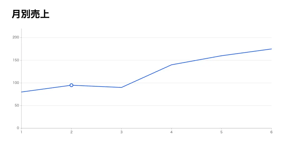
Run npm run dev to check the result. At this stage, the chart shows a line connecting 800,000 yen in January to 1.75 million yen in June. You can also see the line redraw as the viewport width changes.
Overlaying Annotations from Separate Data
Next, display a vertical rule and label in April, when the campaign started. Create src/chart.ts.
import { defineChart, dot, lineY, ruleX, text } from "@tanstack/charts";
import { scaleLinear } from "@tanstack/charts/scales/linear";
import { campaigns, sales } from "./data";

export const salesChart = defineChart({
  marks: [
    ruleX(campaigns, { x: "month", stroke: "#b45309" }),
    lineY(sales, { x: "month", y: "revenue", stroke: "#2563eb" }),
    dot(sales, { x: "month", y: "revenue", fill: "#2563eb", r: 4 }),
    text(campaigns, {
      x: "month",
      y: () => 200,
      text: "label",
      fill: "#92400e",
    }),
  ],
  scales: {
    x: {
      scale: scaleLinear().domain([1, 6]),
      axis: {
        label: "月",
        ticks: { values: [1, 2, 3, 4, 5, 6], format: (value) => `${value}月` },
      },
    },
    y: {
      scale: scaleLinear().domain([0, 220]),
      grid: true,
      axis: { label: "売上(万円)" },
    },
  },
});
The main change is the addition of annotation elements to marks. The array now includes the following elements.
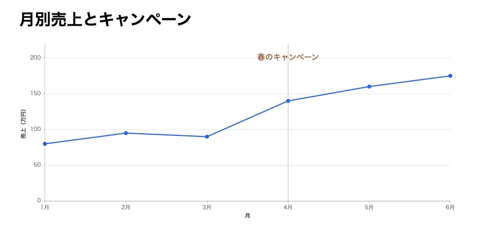
ruleX: For every row in thecampaignsargument, draw a vertical rule at themonthposition specified byx. Becausecampaignscontains only one row withmonth: 4, one rule is drawn in April.dot: Draw a dot for each month's revenue. It uses the samesalesarray aslineY, so the dots overlap the line.text: Show the campaign name above the vertical rule.y: () => 200places the label at the height corresponding to 2 million yen on the vertical axis.
Change the import in App.tsx to salesChart, and change the variable passed to definition. The result is a chart with an annotation.
-import { basicChart } from "./basic";
+import { salesChart } from "./chart";

-        definition={basicChart}
+        definition={salesChart}
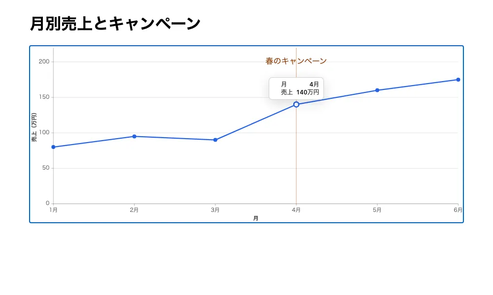
A vertical rule appears in April with the campaign name above it. You can also confirm that the revenue dots overlap the line.
Working with Tooltips and Selected Data
Add tooltip from @tanstack/charts/tooltip to the chart definition, and a built-in tooltip appears when the pointer is placed over a point.
import { defineChart, dot, lineY, ruleX, text } from "@tanstack/charts";
import { scaleLinear } from "@tanstack/charts/scales/linear";
import { tooltip } from "@tanstack/charts/tooltip";
import { campaigns, sales } from "./data";

export const salesChart = defineChart({
  marks: [
    ruleX(campaigns, { x: "month", stroke: "#b45309" }),
    lineY(sales, { x: "month", y: "revenue", stroke: "#2563eb" }),
    dot(sales, { x: "month", y: "revenue", fill: "#2563eb", r: 4 }),
    text(campaigns, {
      x: "month",
      y: () => 200,
      text: "label",
      fill: "#92400e",
    }),
  ],
  scales: {
    x: {
      scale: scaleLinear().domain([1, 6]),
      axis: {
        label: "月",
        ticks: { values: [1, 2, 3, 4, 5, 6], format: (value) => `${value}月` },
      },
    },
    y: {
      scale: scaleLinear().domain([0, 220]),
      grid: true,
      axis: { label: "売上(万円)" },
    },
  },
  tooltip,
});
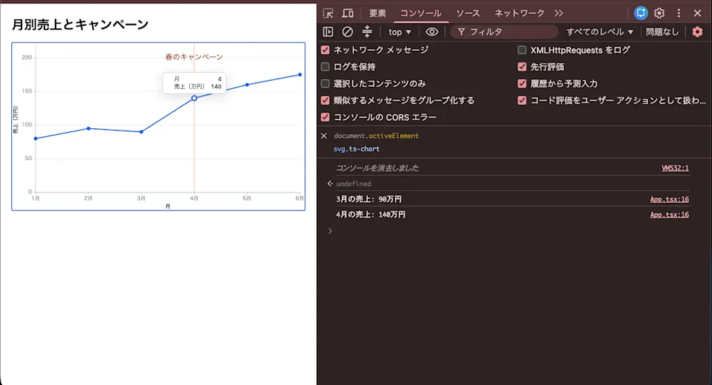
By default, the tooltip is a table of labels and values from x.axis and y.axis. In this example, it displays entries such as 月 4 and 売上(万円) 140.
Now retrieve the original data when a point is selected. Replace src/App.tsx with the following.
import { Chart } from "@tanstack/charts/react";
import { salesChart } from "./chart";

export default function App() {
  return (
    <main>
      <h1>月別売上とキャンペーン</h1>
      <Chart
        definition={salesChart}
        height={360}
        ariaLabel="1 月から 6 月の売上と、4 月のキャンペーン開始時点"
        onSelect={(point) => {
          if (!point) return;
          const row = point.datum;
          if (row.kind === "sale") {
            console.log(`${row.month}月の売上: ${row.revenue}万円`);
          } else {
            console.log(row.label);
          }
        }}
      />
    </main>
  );
}
The point passed to onSelect can be null when there is no target, so the code checks it first. point.datum contains the selected original data. Because this example includes both revenue and campaigns, TypeScript treats the value as Sale | Campaign. The code therefore checks row.kind, logging the month and amount for revenue or the label for a campaign.
When I clicked the April point, the developer console displayed 4月の売上: 140万円. The corresponding revenue value was also visible in the tooltip.
Customizing the Tooltip Content
The default tooltip displayed 月 4 and 売上(万円) 140. Although the horizontal-axis ticks use axis.ticks.format to display 4月, the tooltip still shows 4. The tick format is not applied to the tooltip, so the axis and tooltip use different notation.
To align the display, pass an object with tooltip under use instead of passing tooltip directly. This form lets you specify options alongside it.
-  tooltip,
+  tooltip: {
+    use: tooltip,
+    items: [
+      { channel: "x", label: "月", text: (point) => `${point.xValue}月` },
+      {
+        channel: "y",
+        label: "売上",
+        text: (point) =>
+          point.datum.kind === "sale" ? `${point.datum.revenue}万円` : null,
+      },
+    ],
+  },
 });
items is an array of the rows displayed for a point, in top-to-bottom order. Each row specifies the following.
channel: Whether the row represents thexoryvalue. The function can access the corresponding values aspoint.xValueandpoint.yValue.label: The text used as the row heading. If omitted, the axis label is used.text: A function that constructs the text displayed in the row.
The text function can access point.datum. As with onSelect, the original data type is preserved here, so its type is Sale | Campaign. You must therefore narrow it with kind before reading revenue.
Returning null during that narrowing also has a purpose. A row is hidden when text returns null or undefined. If the target is a campaign point, which has no revenue, only the “revenue” row can be omitted.
With these changes, placing the pointer over the April point produces two rows, 月 4月 and 売上 140万円, matching the notation on the horizontal-axis ticks.
You can change the appearance with custom properties. The tooltip inherits the following variables from ancestor elements, so declaring them on the element around the chart applies the styles.
main {
  --ts-chart-tooltip-background: #1f2937;
  --ts-chart-tooltip-color: #f9fafb;
  --ts-chart-tooltip-border-radius: 8px;
}Summary
- TanStack Charts draws on Observable Plot's way of expressing visualizations while handling application concerns such as sizing, updates, interaction, and framework integration.
- Charts are described by combining marks, channels, scales, and other elements, and each mark can receive a different array and data type.
- In React, pass a definition to
Chart; addingruleXandtextdraws revenue data and separate event data in the same coordinate system. - Adding
tooltipdisplays a built-in tooltip when the pointer is placed over a point. Withitems, you can construct each row's label and text, while custom properties control the appearance. onSelectreceives the original data behind the selected point, which you can narrow by type to handle revenue and campaign names.