
Implementing Masonry Layouts with CSS Grid Lanes
CSS Grid Lanes is a layout method that packs items of differing heights into multiple lanes without gaps. Setting `display: grid-lanes` lets you build a Masonry layout without JavaScript. This article covers the basics of the syntax.
As of July 2026, Safari 26.4 and later is the only browser that implements CSS Grid Lanes. The specification is still being drafted, so the syntax and behavior may change.
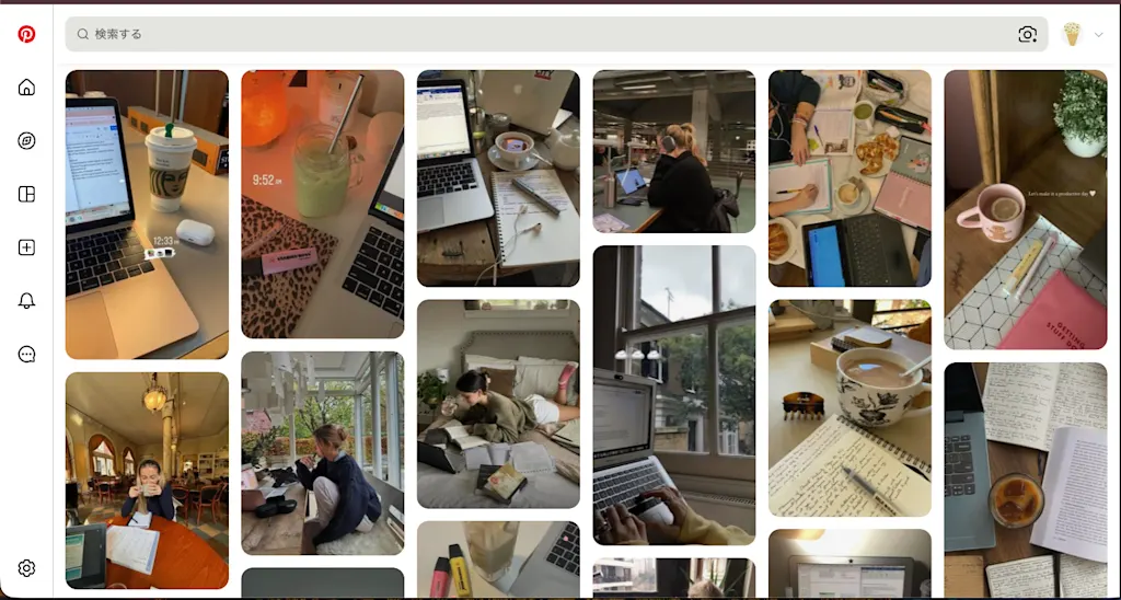
A layout that packs items of differing heights into multiple columns without leaving gaps — like the image galleries on Pinterest — is known as a Masonry layout.
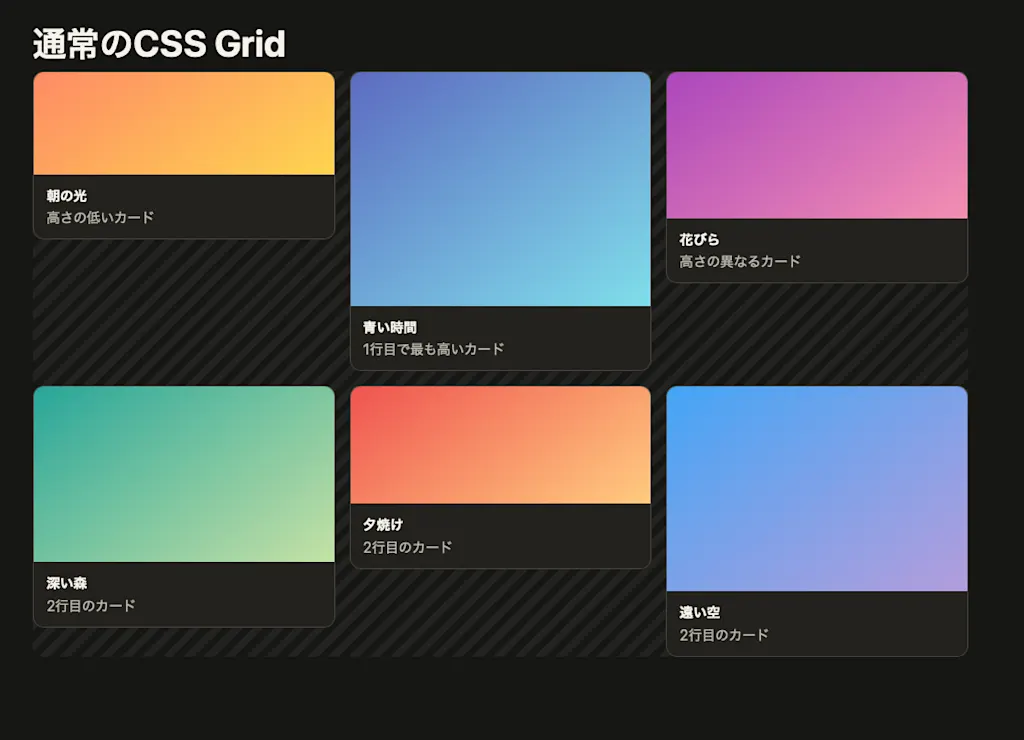
Building a Masonry layout like this is not straightforward, however. When you arrange cards with traditional CSS Grid, every item in the same row is positioned against the tallest item in that row. As a result, cards of differing heights leave empty space beneath them.
<div class="grid">
  <article class="card">...</article>
  <article class="card">...</article>
  <article class="card">...</article>
</div>.grid {
display: grid;
grid-template-columns: repeat(auto-fill, minmax(min(100%, 15rem), 1fr));
align-items: start;
gap: 1rem;
}
Until now, the usual ways to build a Masonry layout have been to reach for a JavaScript library such as Masonry, or to approximate the look with CSS Multi-column Layout.
/* Approximating a Masonry layout with Multi-column Layout */
.gallery {
  columns: 3 15rem;
  column-gap: 1rem;
}

.card {
  break-inside: avoid;
  margin-block-end: 1rem;
}
Calculating item positions in JavaScript makes the implementation complex, and you have to recalculate those positions whenever the viewport resizes or an image finishes loading. The Multi-column Layout approach has a different problem: elements flow from top to bottom before moving to the next column, so the HTML order and the visual order do not line up.
CSS Grid Lanes is a new CSS layout method that solves these problems. By setting display: grid-lanes, you can build a Masonry layout without JavaScript.
The basics of CSS Grid Lanes
To create a column-direction Masonry layout with Grid Lanes, set display: grid-lanes on the container. You define the number and width of the columns with grid-template-columns, exactly as you would with CSS Grid.
.gallery {
  display: grid-lanes;
  grid-template-columns: repeat(3, 1fr);
  gap: 1rem;
}
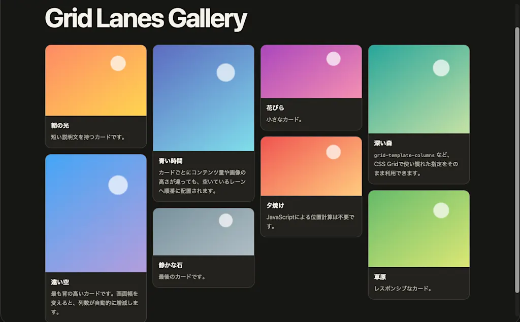
The difference from ordinary CSS Grid is that no row tracks are created. Each item is placed in turn into whichever column is currently shortest. Even when items have different heights, each one sits directly below the previous item in that lane, so no row-based whitespace appears.
Strictly speaking, though, the shortest column is not the only candidate. Columns whose heights differ only slightly are treated as being "the same height," and among those, the HTML order takes priority. You can tune this margin of error with the flow-tolerance property, described later in this article.
Combining repeat() and minmax() gives you a responsive layout without media queries.
.gallery {
  display: grid-lanes;
  grid-template-columns: repeat(auto-fill, minmax(min(100%, 15rem), 1fr));
  gap: 1rem;
}
As many columns of at least 15rem as will fit are created for the available width. Once the container becomes too narrow to fit another 15rem column, the column count drops automatically. The min(100%, 15rem) is there to keep the columns from overflowing horizontally when the container itself is narrower than 15rem.
The demo below arranges eight cards of differing heights with Grid Lanes. Resize the window and you will see the column count change automatically.
Laying out items along rows
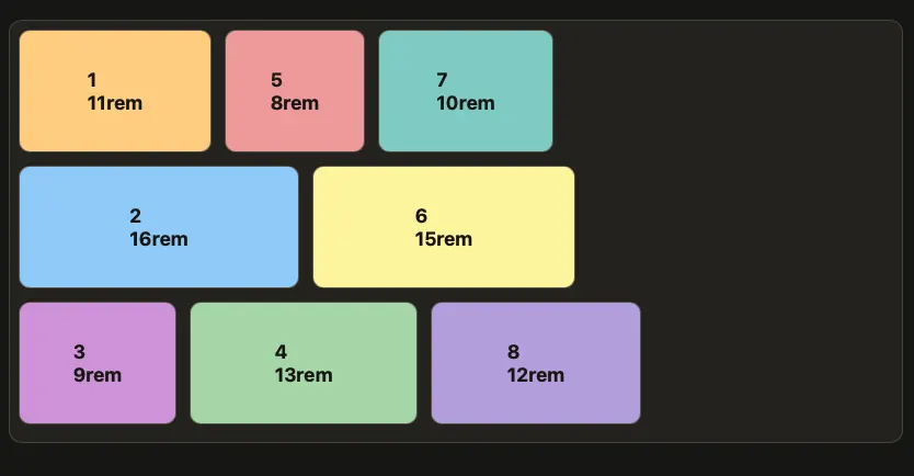
If you specify grid-template-rows instead of grid-template-columns, rows are used as the lanes and items stack horizontally. The example below places six cards of differing widths into three row lanes.
<section class="gallery">
  <article class="card">1</article>
  <article class="card">2</article>
  <article class="card">3</article>
  <!--... -->
</section>.gallery {
display: inline-grid-lanes;
grid-template-rows: repeat(3, 7rem);
gap: 1rem;
}
.card {
width: var(--card-width);
}
.card:nth-child(1) { --card-width: 11rem; }
.card:nth-child(2) { --card-width: 16rem; }
.card:nth-child(3) { --card-width: 9rem; }
/* ... */Note that display is set to inline-grid-lanes here rather than grid-lanes. The difference between the two has nothing to do with lane direction — it is whether the container itself generates a block-level box or an inline-level box. In this example we want the container's width to hug the combined width of the cards, so the inline-level inline-grid-lanes is the right choice.
Just as column-direction Grid Lanes places the next item into the currently shortest column, this example places the next item into whichever row currently has the least width filled. Because each card has a different width, the items stack from left to right in a masonry pattern.
For now, the lane direction is determined by whether you specified grid-template-columns or grid-template-rows. Whether the existing grid-auto-flow should be reused to state the direction explicitly, or a dedicated property (something like grid-lanes-direction) should be added, is still under discussion in the CSS Working Group.
Spanning items across multiple lanes
The benefit of Grid Lanes reusing CSS Grid's properties for track sizing and placement is not just that the two look alike when you write them. The placement features you already had in CSS Grid carry over as they are.
For example, grid-column lets you make specific items span multiple lanes. In the example below, only the cards carrying .card--featured take up two columns of width.
.gallery {
  display: grid-lanes;
  grid-template-columns: repeat(auto-fill, minmax(min(100%, 15rem), 1fr));
  gap: 1rem;
}

.card--featured {
  grid-column: span 2;
}
An item that spans multiple lanes is aligned to the end of whichever spanned lane is filled the furthest. That can leave some whitespace on the shorter lane's side, but it lets you highlight just the products or articles you want to draw attention to, all without JavaScript.
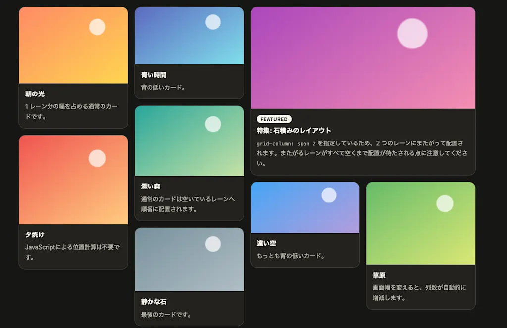
Beyond the relative sizing that span gives you, explicit placement by line number is available too. The example below uses negative line numbers to keep the header in the last two columns at all times. Even as the column count changes responsively, the instruction to occupy the final two columns still holds.
.header {
  grid-column: -3 / -1;
}
Controlling placement order with flow-tolerance
As a rule, Grid Lanes places the next item into whichever lane is currently shortest. Suppose you have placed some items across three columns and their heights end up as follows.
Column 1: 200px
Column 2: 208px
Column 3: 260px
If the shortest column simply wins, the next item goes into column 1. But the gap between columns 1 and 2 is only 8px. Always picking the shortest column even for a difference this small makes items jump left and right, and the visual flow can end up far removed from the HTML order.
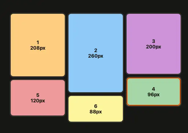
flow-tolerance is the property that specifies how large a height difference between lanes can be while still counting as "about the same."
.gallery {
  display: grid-lanes;
  grid-template-columns: repeat(3, 1fr);
  flow-tolerance: 10px;
}
In this example, any lane within 10px of the shortest one — column 1 — is treated as a candidate of equal height. Column 2 is only 8px away, so columns 1 and 2 count as the same height. Column 3 is 60px taller and therefore does not qualify. When several candidates exist, the one chosen is the first lane at or after the lane where the previous item was placed. In other words, as long as the heights stay comparable, items fill in from left to right. Once the last lane is reached, placement wraps back around to the first lane.
The initial value of flow-tolerance is normal. In Grid Lanes, the used value of normal is 1em, so slight differences in height are ignored. The reason em is used rather than px is that the tolerance is based on the container's font size. The larger the type in a layout, the larger the tolerance becomes automatically, so a difference of roughly one line of body text is treated as the same height.
Lowering the value prioritizes filling in the available space. With 0, only the genuinely shortest lane is a candidate for placement.
.gallery {
  flow-tolerance: 0;
}
Raising the value has the opposite effect: lanes of somewhat different heights count as equal, which makes it easier to preserve a natural order close to the HTML. Push it too far, though, and items land in a long lane even when a shorter one is available, which can produce large gaps or big vertical jumps.
Setting infinite ignores lane heights altogether and places items strictly in lane order.
.gallery {
  flow-tolerance: infinite;
}
For instance, with six items in a three-column Grid Lanes container, items 1, 2, and 3 go into columns 1, 2, and 3 respectively, and items 4, 5, and 6 do the same — regardless of how tall they are.
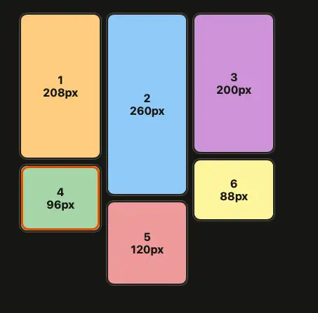
This arrangement preserves a left-to-right flow that follows the HTML order. On the other hand, because lane heights are ignored entirely, a shorter lane goes unused even when it has room, which can leave large gaps.
The standardization debate around Masonry in CSS
The effort to bring Masonry layouts to CSS began when Mozilla shipped it as a flagged feature in Firefox in 2020. A long debate followed over whether Masonry should be treated as part of CSS Grid or as a layout method of its own.
Integrating it into CSS Grid
The early proposal — implemented by Mozilla and backed by WebKit — combined display: grid with grid-template-rows: masonry.
.gallery {
  display: grid;
  grid-template-columns: repeat(3, 1fr);
  grid-template-rows: masonry;
}
This proposal frames Masonry as "CSS Grid with one axis collapsed." Its advantage is that CSS Grid features such as track sizing, explicit placement, spanning multiple tracks, and subgrid all carry over unchanged. It also avoids having to define a duplicate set of Grid-like properties just for Masonry.
Making it a separate layout method
The Chrome and Edge teams, meanwhile, proposed display: masonry as a layout method of its own.
.gallery {
  display: masonry;
  grid-template-columns: repeat(3, 1fr);
  gap: 1rem;
}
CSS Grid positions items along two axes — rows and columns — whereas Masonry only defines tracks on one axis. And where CSS Grid determines track sizes before placing items, Masonry has item placement and track sizing influence each other. Given differences in the layout algorithm like these, the argument goes, Masonry is easier to reason about when expressed as a layout method separate from Grid.
Chrome 140 and later shipped an experimental implementation using display: masonry, but that syntax is now outdated.
display: grid-lanes in the current draft
At one point there was also a proposal to control item placement across Grid, Flexbox, and Masonry through a shared item-flow property. The current CSS Grid Level 3 Editor's Draft does not adopt that idea and instead treats Masonry layout as Grid Lanes.
.gallery {
  display: grid-lanes;
  grid-template-columns: repeat(3, 1fr);
}
In dedicating a display value to it, this resembles Chrome's proposal. At the same time, it reuses CSS Grid's properties for track sizing and item placement, so the powerful Grid features WebKit cared about remain available. The current draft, in other words, has arrived at a syntax that incorporates both sides of the argument. That said, the specification as a whole is still being drafted, and open questions remain.
Visual order and accessibility
Using Grid Lanes does not change the HTML order itself. Focus movement via the Tab key and screen reader announcements still follow the order written in the HTML.
WCAG 2.2 Understanding 2.4.3 requires that when the order of content affects its meaning, the correct reading order can be programmatically determined. Focus order and visual order do not have to match perfectly, but you should avoid arrangements where focus appears to jump around at random and leaves users disoriented.
If flow-tolerance is too small, the focus ring moves left and right frequently and becomes hard to follow visually. Too large a value has its own risk: focus can make large vertical jumps. Rather than simply minimizing gaps, it is important to check how much your content varies in height, walk through the interaction order, and choose an appropriate value.
When the order of content carries meaning — product listings or search results, for example — it is worth asking whether Grid Lanes should be used purely to tighten up the visuals. It is a better fit for content like photo galleries, where each item stands on its own and order matters little.
Falling back for unsupported browsers
In browsers that do not support Grid Lanes, the display: grid-lanes declaration is invalid. You can provide a fallback by specifying ordinary CSS Grid first and switching to Grid Lanes inside @supports.
.gallery {
  display: grid;
  grid-template-columns: repeat(auto-fill, minmax(min(100%, 15rem), 1fr));
  gap: 1rem;
}

@supports (display: grid-lanes) {
  .gallery {
    display: grid-lanes;
  }
}
Unsupported browsers render an ordinary Grid, so row-based whitespace appears between items but the content remains perfectly readable. That makes Grid Lanes easy to adopt as progressive enhancement that simply makes the layout more appealing.
Summary
- CSS Grid Lanes lets you arrange items of differing heights into a Masonry layout without JavaScript
- Combine
display: grid-laneswith the properties already used in CSS Grid, such asgrid-template-columnsandgrid-template-rows - CSS Grid placement features like
grid-column: span 2carry over as they are, letting specific items span multiple lanes - After a long debate over whether to integrate Masonry into CSS Grid or make it a separate layout method, the current draft adopts Grid Lanes, which has characteristics of both
flow-toleranceis the tolerance for treating height differences between lanes as equal, balancing tight packing against a natural placement order- Use
@supportsto fall back to ordinary CSS Grid for browsers that do not yet support it
References
CSS Grid Layout Module Level 3
Introducing CSS Grid Lanes | WebKit
Brick by brick: Help us build CSS Masonry | Chrome for Developers
Masonry layout - CSS | MDN