Decorating CSS Grid Layout Gaps with `column-rule` and `row-rule`
CSS Gap Decorations introduces `column-rule` and `row-rule` properties that work with flexbox and grid, enabling decorative lines between columns and rows — no more border or background-color workarounds.
Decorating grid layouts with dividing lines between columns is a common requirement. CSS has the column-rule property for drawing dividing lines between columns, but it is exclusive to multi-column layout (multicol) and does not apply to flexbox or grid.
Despite widespread demand for drawing lines between columns in flexbox or grid layouts, no dedicated CSS mechanism existed. Developers resorted to workarounds such as applying borders to specific items, using background colors to simulate dividers, or using ::before pseudo-elements to draw lines.
/* Method 1: Add border-right / border-bottom to each item, then remove them from the last column/row */
.card {
  border-right: 1px solid #ccc;
  border-bottom: 1px solid #ccc;
}
.card:nth-child(3n) {
  border-right: none;
}
.card:nth-last-child(-n + 3) {
  border-bottom: none;
}
/* Method 2: Fill the gap with a background color */
.grid {
display: grid;
grid-template-columns: repeat(3, 1fr);
gap: 1px;
background-color: #ccc;
}
.card {
/* Fill each cell with a background color */
background-color: white;
}However, these workarounds are unintuitive and require extra code solely for visual presentation, which conflicts with the principle of semantic HTML. The border approach also has a maintainability problem: when column widths change, the line positions shift as well, requiring nth-child selectors to be updated every time.
To solve these issues, a proposal was made to extend the existing column-rule (formerly limited to multicol) to flexbox and grid layouts, while adding a complementary row-rule property for drawing lines between rows. With these properties, it becomes easy to draw lines between columns and rows in flexbox or grid.
CSS Gap Decorations is currently an experimental feature. It is available as a Developer Trial in Chrome and Edge 139. To use it, enable Experimental Web Platform Features at chrome://flags/#enable-experimental-web-platform-features (or edge://flags/#enable-experimental-web-platform-features for Edge).
This article explains how to use column-rule and row-rule to decorate gaps in CSS Grid Layout.
Using column-rule and row-rule
The code for drawing lines between columns using column-rule and row-rule is very simple. Add gap to a flexbox or grid container for spacing, then apply column-rule / row-rule for decoration.
column-rule is a shorthand for three sub-properties: column-rule-width (line thickness), column-rule-style (line style), and column-rule-color (line color). Similarly, row-rule is a shorthand for row-rule-width, row-rule-style, and row-rule-color.
.grid {
  display: grid;
  grid-template-columns: repeat(3, 1fr);
  gap: 16px;
  column-rule: 1px solid #ccc;
  row-rule: 1px solid #ccc;
}
It also works with flexbox. Even when combined with display: flex and flex-wrap: wrap, column-rule and row-rule apply decorations to the gaps.
.flex {
  display: flex;
  flex-wrap: wrap;
  gap: 16px;
  column-rule: 1px solid #ccc;
  row-rule: 1px solid #ccc;
}
Drawing Complex Patterns with repeat()
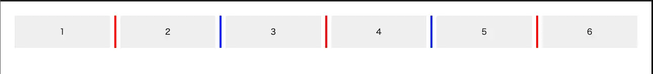
The rule-color property specifies the color of gap decorations. It can be combined with the repeat() function to define complex color patterns. The following example alternates the column rule color between red and blue.
.grid {
  display: grid;
  grid-template-columns: repeat(6, 1fr);
  gap: 20px;
  column-rule-width: 4px;
  column-rule-style: solid;

  /* Alternate between red and blue */
  column-rule-color: repeat(auto, red, blue);
}
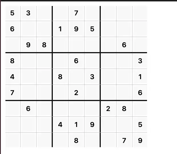
The rule-width property can also be combined with repeat(). This makes it easy to draw thicker lines every three columns in a sudoku-like grid to clearly delineate sections.
.sudoku {
  --cell: 48px;

  display: grid;
  grid-template-columns: repeat(9, var(--cell));
  grid-template-rows: repeat(9, var(--cell));
  gap: 8px;
  padding: 8px;
  width: max-content;

  /* Draw thicker lines every 3 columns */
  column-rule:
    repeat(2, 1px solid #bbb),
    4px solid #111,
    repeat(2, 1px solid #bbb),
    4px solid #111,
    repeat(2, 1px solid #bbb);

  row-rule:
    repeat(2, 1px solid #bbb),
    4px solid #111,
    repeat(2, 1px solid #bbb),
    4px solid #111,
    repeat(2, 1px solid #bbb);
}
Controlling How Lines Break at Intersections with rule-break
rule-break is a property that specifies whether decoration lines break at intersections. The default is normal, where lines break at T-intersections but continue through cross-intersections.
Think of a spreadsheet-style table layout. When a cell spans multiple columns, a T-intersection occurs. With rule-break: normal, you can see that the line between the merged columns is interrupted.
The other values for rule-break are:
none: Ignores cell span and always draws lines from end to end of the gap. Lines pass through even when cells are merged.intersection: Adjusts rendering at cross-intersection points wherecolumn-ruleandrow-rulemeet, so they do not overlap. Produces a clean finish at grid intersections.
In the cell-span example above, setting rule-break: none causes the line between merged columns to be drawn without interruption.
The difference between rule-break: intersection and rule-break: normal shows up at cross-intersection points. With normal, column-rule and row-rule are drawn overlapping each other, whereas with intersection, the rendering at the intersection is adjusted so the lines appear as a uniform grid. For table-like layouts where rows and columns are equally important, intersection is the better choice.
Summary
- To address the problem of needing workarounds to draw lines between columns in grid layouts,
column-rulecan now be applied to flexbox and grid, and a newrow-ruleproperty has been added for drawing lines between rows - Using
column-ruleandrow-rule, you can easily draw lines between columns and rows - Using
repeat()in value specifications allows you to create complex line patterns - The
rule-breakproperty controls whether lines break at intersections. The default isnormal, where lines break at T-intersections but continue through cross-intersections. Setting it tointersectionproduces a natural look in table-like layouts where lines do not overlap at intersection points