
Balancing Flexbox Lines with flex-wrap: balance
With flex-wrap: wrap, the last line often holds just a few items, leaving the lines badly unbalanced. flex-wrap: balance keeps the line count that normal wrapping produces while redistributing flex items so each line comes out about the same length.
When you lay out tags or navigation items in a row with Flexbox, you reach for flex-wrap: wrap so that items which don't fit in the container move to the next line. Normal wrapping packs as many items as possible onto each preceding line, though, which can leave a single item stranded on the last line. And when that lone item stretches to fill the container thanks to flex-grow, the size difference against the items on the other lines becomes hard to miss.
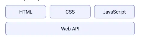
You could work around this imbalance by adding margins at specific widths with a container query, or by adjusting the container width with JavaScript. But both require recalculating every time the element's width changes, which makes the implementation more complicated.
.tags {
  container-type: inline-size;
  display: flex;
  flex-wrap: wrap;
  gap: 12px;
}

/* Assumes that at this width exactly one item is left on the last line */
@container (400px <= width < 460px) {
  .tags li:last-child {
    flex-grow: 0; /* Don't let it consume the leftover space by growing */
    margin-inline: auto; /* Split the leftover space evenly on both sides to center it */
  }
}
flex-wrap: balance is a value that keeps the line count determined by normal wrapping while distributing flex items so that every line ends up close to the same length. This article covers how to use flex-wrap: balance and how flex items get distributed across lines.
As of August 2026, flex-wrap: balance is only available in Chrome and Edge 150 and later. Firefox and Safari do not support it. CSS Flexible Box Layout Module Level 2 is an Editor's Draft, so the specification may still change.
flex-wrap: wrap leaves the last line unbalanced
Let's start by looking at how a normal flex-wrap: wrap distributes flex items across lines. The example below turns a list into a flex container and gives each item flex: 1 1 80px.
<ul class="tags">
  <li>HTML</li>
  <li>CSS</li>
  <li>JavaScript</li>
  <li>Web API</li>
</ul>.tags {
display: flex;
flex-wrap: wrap;
gap: 12px;
max-inline-size: 430px;
margin: 0;
padding: 0;
list-style: none;
}
.tags li {
flex: 1 1 80px;
padding: 0.75rem 1rem;
border: 1px solid #6d7fc6;
border-radius: 0.5rem;
background: #eef1ff;
text-align: center;
}The three values of flex are, in order, flex-grow, flex-shrink, and flex-basis. In this example each item gets a base width of 80px and grows at the same rate whenever there is space left over on the line.
What the wrapping decision actually uses is 114px: the 80px flex-basis plus the horizontal padding and border. With a container width of 430px, three items on the first line add up to 114px * 3 + 12px * 2 = 366px and fit, while four come to 114px * 4 + 12px * 3 = 492px and overflow the container. Since the normal wrapping algorithm keeps adding to the current line until the next item no longer fits, only the fourth item is pushed to the second line. flex-grow is then resolved per line, so the item on the second line stretches all the way across.
Using flex-wrap: balance
Setting flex-wrap to balance evens out the lengths of the wrapped lines.
  .tags {
    display: flex;
-   flex-wrap: wrap;
+   flex-wrap: balance;
    gap: 12px;
  }
With this change, the four items from before are placed two on the first line and two on the second. Because flex-grow is resolved per line, the items on both lines grow to roughly the same size.
When you specify balance on its own, it behaves as if wrap — which stacks lines in the normal direction — had been specified as well. To state the direction explicitly, you can combine the two keywords like this:
.tags {
  flex-wrap: wrap balance;
}

.tags--reverse {
  flex-wrap: balance wrap-reverse;
}
How flex items get distributed across lines
Normal wrap uses a greedy approach: it takes items from the start and keeps adding them to the current line until the next one no longer fits. Once an item has landed on the first line, it is never moved to the second line to improve the overall result.
The balance algorithm, by contrast, picks the break points using the following steps:
- Determine the number of lines a normal
wrapwould generate - Divide the items into that many contiguous groups, preserving DOM order
- Assign at least one item to each line
- Treat the difference between the container width and the sum of the items' pre-flex widths (including margins) on a line as that line's "error", then choose the division that minimizes the sum of the squared errors across all lines
For example, the four items above produce two lines under a normal wrap. balance keeps that count of two, but splitting them 2 + 2 rather than 3 + 1 brings the leftover space on each line closer together, so the third item moves to the second line.
balance is not simply a feature for equalizing the number of items per line. It takes each item's width before it flexes, adds the margins, and divides the items so that the width each line uses is as close as possible. That means when items have different widths, a division with a different number of items per line may well be the one that gets chosen.
Once the items have been assigned to lines, the normal Flexbox flexing pass runs per line. That's why, in the example with flex-grow, the items on each of the 2 + 2 lines grow to roughly the same size.
Setting a minimum line count with flex-line-count
By default, the number of lines balance uses is the same as it would be if the items were laid out with wrap. If every item fits in the container, specifying balance still leaves you with a single line.
CSS Flexible Box Layout Module Level 2 also defines a flex-line-count property for specifying the minimum line count to use for balancing.
.tags {
  display: flex;
  flex-wrap: balance;
  flex-line-count: 5;
}

.tags li {
  flex: 1 1 0;
  min-inline-size: 0;
}
Since flex-basis is 0 the items would normally fit on a single line, but this example splits them across at least five lines and balances them there. The accepted values are integers of 1 or greater, and the initial value is 1.
Note that flex-line-count is not a maximum line count. If six or more lines are needed to fit all the items, as many lines as necessary are created even with flex-line-count: 5 in place.
Conversely, the value you specify is clamped from above by the number of items. With flex-line-count: 5 but only two items, the minimum line count is treated as 2. Since balance assigns at least one item to every line, it never creates more lines than there are items.
Why it was designed as a flex-wrap value
The desire to distribute flex items evenly across lines is nothing new. In a 2014 CSSWG discussion, the idea of
flex-wrap: balance itself found support, but adding it to Flexbox Level 1 was deferred. It was then proposed again in 2018 as CSSWG Issue #3070.
The proposal's explainer argued for
flex-wrap: balance on the grounds that its meaning is easy to infer from the existing text-wrap: balance, and that it is a natural extension of flex-wrap, the property that controls how wrapping happens. There is also a competing view, however, that whether to wrap and how to place items are separate concerns.
In a September 2025 CSSWG discussion, the group considered making balancing a standalone property such as
item-pack: balance.
Summary
flex-wrap: balancekeeps the line count determined by a normalwrapwhile picking new break points so that the sum of the items' pre-flex widths on each line comes out close to the sameflex-line-countspecifies, as an integer of1or greater, the minimum line count used whenbalancedistributes items- It was designed as a natural extension of
flex-wrap— the property that controls how wrapping happens — with a meaning that's easy to infer from the existingtext-wrap: balance, but making it a standalone property such asitem-pack: balancehas also been considered
References
CSS Flexible Box Layout Module Level 2
CSSWG Issue #3070: Add flex-wrap: balance
CSS Working Group Teleconference – 17 September 2025
Chrome 150 release notes
Web features explorer - flex-wrap: balance