Canvas UI is a component library that uses the HTML-in-Canvas API to build creative interfaces with effects such as fluid simulations and shaders. HTML-in-Canvas is an experimental API that makes the rendered output of HTML elements placed inside a
<canvas> element available to 2D Canvas, WebGL, and WebGPU. Because the original HTML remains in the DOM, WebGL effects can be applied while preserving pointer and keyboard interaction and participation in the accessibility tree, provided that the canvas rendering and DOM positions are synchronized correctly.
As of July 2026, the HTML-in-Canvas API is available as an Origin Trial in Chrome 148–150. To try it locally, enable the chrome://flags/#canvas-draw-element flag in Chrome Canary 149 or later. Making the feature available to general users requires registering for the Origin Trial and configuring a trial token.
The components support a variety of frameworks, including React, Solid, Vue, and Svelte. They are distributed through a shadcn/ui registry and become part of your own source code after installation. This makes the components easy to customize and extend.
Browsers that do not support the HTML-in-Canvas API fall back to rendering regular HTML. Some effects, including Droplets and Glass, continue to work as WebGL overlays, but the full experience of transforming rendered HTML as a texture requires the HTML-in-Canvas API.
In this article, I will walk through my experience trying Canvas UI.
Installing Canvas UI
This example uses Canvas UI with React. Because the components are distributed through a shadcn registry, you install them individually. You must also run shadcn init beforehand.
npx shadcn@latest initBrowse the Canvas UI component catalog and find a component that interests you.
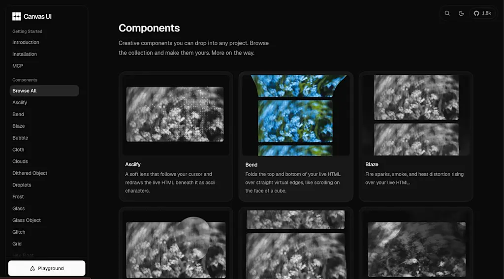
As an example, let's install the Droplets component. This component creates an animation of liquid droplets running down the screen. Install it using the shadcn CLI.
npx shadcn@latest add @canvas-ui/droplets-reactAfter installation, the src/components/canvasui/Droplets.tsx file is created. Add it to your application to start using the Canvas UI component.
"use client";

import {
  useEffect,
  useRef,
  useState,
  useSyncExternalStore,
  type ReactNode,
} from "react";

export interface DropletsOptions {
  /** How much rain falls, from a light drizzle to a downpour (0 to 1.25). */
  intensity?: number;
  /** Animation speed multiplier. */
  speed?: number;
  /** Size of the droplet pattern. Higher means smaller drops. */
  scale?: number;
  /** Width of the droplets and their trails. */
  dropWidth?: number;
  /** How elongated the falling droplets are. */
  dropLength?: number;
  /** How strongly droplets refract the content behind them. */
  refraction?: number;
  /** Background blur outside the droplets, like a fogged up window. */
  blur?: number;
  /** Darkens the edges of the canvas (0 to 1). */
  vignette?: number;
  /** How fast the running drops slide down. */
  fallSpeed?: number;
  /** Horizontal wiggle of the running drops. */
  wiggle?: number;
  /** Multiplier for the small static droplets. */
  staticDrops?: number;
  /** Wipe drops off the glass with the pointer. */
  interactive?: boolean;
  /** Radius of the cursor wipe, relative to the screen height. */
  interactionRadius?: number;
  /** How strongly the cursor wipes drops off the glass (0 to 1). */
  interactionStrength?: number;
  /** How much the wipe distorts the content behind it. */
  interactionDistortion?: number;
  /** Tint color layered over the content as [r, g, b] in 0-1 range. */
  tint?: [number, number, number];
  /** Strength of the tint (0 to 1). */
  tintStrength?: number;
}

// ...
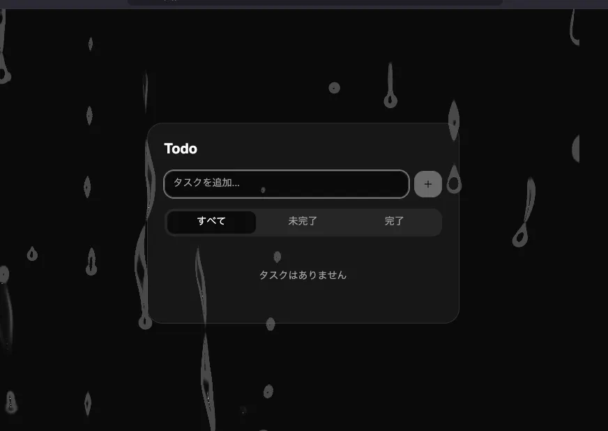
Wrapping the entire application in the <Droplets> component applies an animation of liquid droplets running across the whole screen.
import { TodoApp } from "@/components/TodoApp";
import Droplets from "@/components/canvasui/Droplets";

function App() {
  return (
    <Droplets className="flex min-h-svh items-center justify-center bg-background p-6">
      <TodoApp />
    </Droplets>
  );
}

export default App;
Even with the animation applied, the Todo application remains fully interactive.
In browsers that do not support the HTML-in-Canvas API, the droplet animation is rendered as a WebGL overlay. Although this fallback cannot transform the rendered HTML as a texture, the interface remains fully interactive.
By adjusting the props, you can change the speed and amount of rainfall, the droplet size, and more. For example, changing blur adds a fogged-window effect that blurs the background.
import { TodoApp } from "@/components/TodoApp";
import Droplets from "@/components/canvasui/Droplets";

function App() {
  return (
    <Droplets blur={5} className="flex min-h-svh items-center justify-center bg-background p-6">
      <TodoApp />
    </Droplets>
  );
}

export default App;
The entire view takes on a foggy appearance, while only the areas wiped with the pointer become clear—a delightful effect.
Let's look at a few more components. The HexFloat component divides the screen into glossy hexagonal tiles, adding perspective that makes the page appear tilted backward along with a floating effect. As you move the cursor, nearby tiles flatten to reveal a readable area of the content.
npx shadcn@latest add @canvas-ui/hex-float-reactTyping directly on the tilted screen feels delightfully strange.
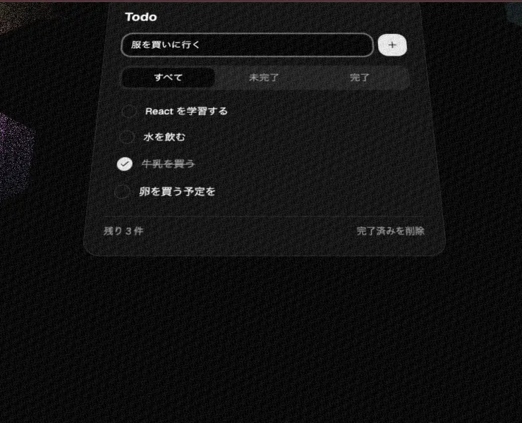
The Glass component creates a glass lens that follows the cursor.
npx shadcn@latest add @canvas-ui/glass-react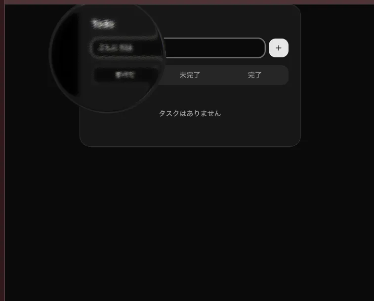
The Shatter component creates an effect that makes the area around the cursor break into glass-like shards.
npx shadcn@latest add @canvas-ui/shatter-react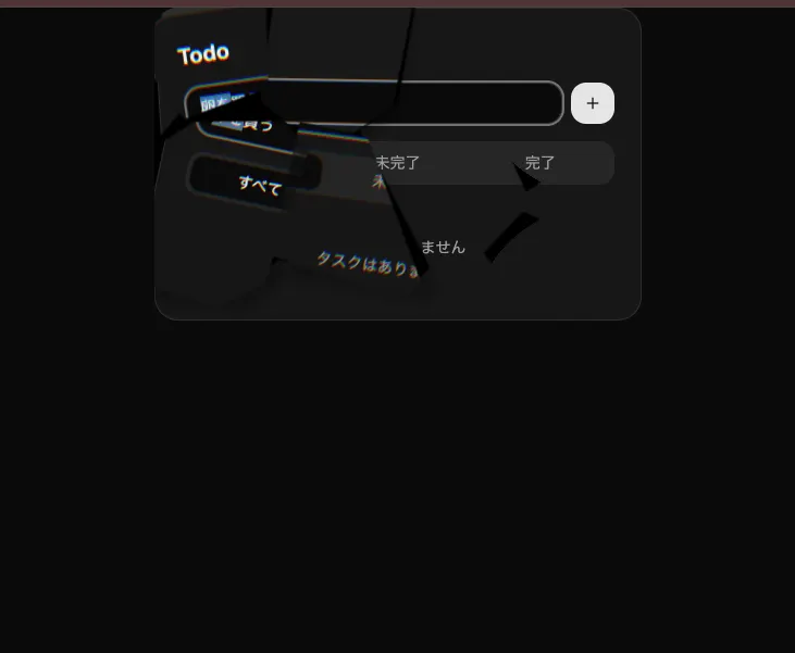
Summary
- Canvas UI is a component library that uses the HTML-in-Canvas API to apply WebGL effects to the rendered output of HTML elements
- The original HTML remains in the DOM and is designed to preserve interactivity and accessibility when implemented correctly
- HTML-in-Canvas is an experimental Chrome feature; trying it locally requires enabling the
chrome://flags/#canvas-draw-elementflag in a supported version of Chrome Canary - Browsers that do not support HTML-in-Canvas fall back to regular HTML rendering, while some effects continue to work as WebGL overlays
- Canvas UI supports a variety of frameworks, including React, Solid, Vue, and Svelte
- Components are distributed through a shadcn registry and can be installed with
npx shadcn@latest add @canvas-ui/<component-name> - Props make it easy to create a wide range of effects, including rain with
Droplets, a tilted screen withHexFloat, a cursor-following glass lens withGlass, and a shattered area around the cursor withShatter