Trying Out Storybook MCP
Storybook MCP connects Storybook with AI agents, enabling them to generate code while referencing component documentation and to test UI components by creating stories. This article shares hands-on experience using Storybook MCP.
When delegating UI generation to an AI agent, you may find that the agent ignores the UI components you've already prepared and generates a UI inconsistent with your design system. And without a proper environment for running UI interaction tests, issues often only surface when a human manually tries the UI — leading to an inefficient back-and-forth of feedback to the AI. Storybook MCP addresses these challenges by giving agents the ability to generate code while directly referencing Storybook documentation, and to autonomously run story tests as part of the workflow.
This article shares hands-on experience using Storybook MCP.
As of March 25, 2026, Storybook MCP is only available for React-based Storybook setups.
Setting Up Storybook MCP
To use Storybook MCP, the @storybook/addon-mcp addon is required. Install it with the following command:
npm install @storybook/addon-mcpOpen .storybook/main.ts and add @storybook/addon-mcp to the addons list.
export default {
"stories": [
"../src/**/*.stories.mdx",
"../src/**/*.stories.@(js|jsx|ts|tsx)"
],
"addons": [
"@chromatic-com/storybook",
"@storybook/addon-vitest",
"@storybook/addon-a11y",
- "@storybook/addon-docs"
+ "@storybook/addon-docs",
+ "@storybook/addon-mcp"
],
"framework": "@storybook/react-vite"
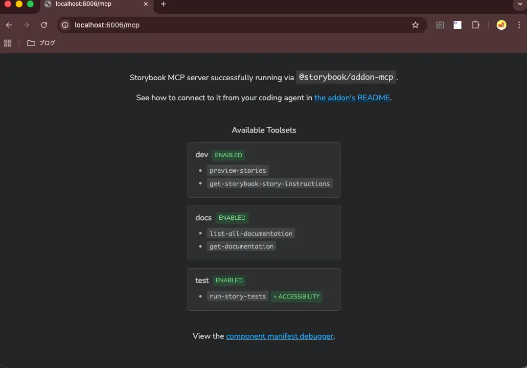
};Once @storybook/addon-mcp is added, start Storybook.
npm run storybookVerify that the http://localhost:6006/mcp endpoint is available.
Connect the MCP server to your AI agent using HTTP transport. The exact connection method depends on your coding agent, but here we'll use Claude Code as an example. The following command connects the MCP server to Claude Code at the project level. If you have Storybook deployed somewhere like Chromatic, you can specify that URL instead.
claude mcp add --transport http storybook http://localhost:6006/mcp --scope projectA .mcp.json file will be created in the project root directory, storing the MCP server connection settings.
{
  "mcpServers": {
    "storybook": {
      "type": "http",
      "url": "http://localhost:6006/mcp"
    }
  }
}
With Storybook still running, start Claude Code and use the /mcp command to confirm that Storybook is connected.

Storybook MCP provides the following six tools:
list-all-documentation: Retrieves a list of available component and documentation IDs. SpecifyingwithStoryIds: truealso returns story IDs.get-documentation: Retrieves detailed component documentation (props, usage examples, stories) by specifying an ID.get-documentation-for-story: Retrieves additional documentation for a specific story variant.get-storybook-story-instructions: Retrieves comprehensive guidelines for creating, updating, and fixing story tests. Calling this before working with story files ensures the agent follows correct patterns and import paths.preview-stories: Returns a preview URL after component or story changes. Call this after each change and present the resulting URL to the user.run-story-tests: Runs story tests. If any fail, the agent fixes them before reporting completion.
Try sending a prompt like "list all documented components" to Claude Code to confirm that Storybook MCP is working. You can see the list-all-documentation tool being called to retrieve the component list.

If needed, documenting tool usage instructions in agent-facing files like AGENTS.md or CLAUDE.md can help the agent use the tools correctly.
When working on UI components, always use the `your-project-sb-mcp` MCP tools to access Storybook's component and documentation knowledge before answering or taking any action.

- **CRITICAL: Never hallucinate component properties!** Before using ANY property on a component from a design system (including common-sounding ones like `shadow`, etc.), you MUST use the MCP tools to check if the property is actually documented for that component.
- Query `list-all-documentation` to get a list of all components
- Query `get-documentation` for that component to see all available properties and examples
- Only use properties that are explicitly documented or shown in example stories
- If a property isn't documented, do not assume properties based on naming conventions or common patterns from other libraries. Check back with the user in these cases.
- Use the `get-storybook-story-instructions` tool to fetch the latest instructions for creating or updating stories. This will ensure you follow current conventions and recommendations.
- Check your work by running `run-story-tests`.

Remember: A story name might not reflect the property name correctly, so always verify properties through documentation or example stories before using them.
Next, let's look at some concrete use cases for Storybook MCP.
Generating UI by Reusing Existing Components
With Storybook MCP, you can generate code while referencing UI component documentation. Let's pass a prompt like "create a login form" and have it generate a UI.
You can see the agent using the list-all-documentation and get-documentation tools to look up documentation for components needed for a login form (text fields, buttons, etc.) before forming an implementation plan.

Using get-documentation, the agent checks the <Button> component's documentation, story variants (Primary, Secondary, Disabled), and props specifications. As also noted in Best practices for using Storybook with AI, it's important to document what purpose each component is intended for and why it should be used in that context (e.g., Primary is for main actions like form submission; Danger is for destructive operations like delete or reset). The quality of the code generated by AI agents will likely depend heavily on how thoroughly components are documented — including how each prop should be used.


Because the agent reviewed the component specifications in detail beforehand, it clearly identifies which props to use even at the planning stage.

Using the components referenced above, the agent generates the LoginForm component and its stories, along with a proposal for interaction test coverage.


Once the UI implementation is complete, you can see the agent using the run-story-tests tool to run story interaction tests. When tests fail, the agent autonomously fixes the issues and reruns the tests. It even catches accessibility issues like insufficient color contrast ratios.

After all tests pass, the preview-stories tool returns the preview URL in Storybook. Let's take a look at how the generated code renders in Storybook.


For agents that support MCP Apps, such as VSCode's Copilot Agent, it appears you can preview generated stories inline.

Here is the actual code that was generated. The per-variant story documentation could use a bit more detail, but the key test cases are well covered.
import type { Meta, StoryObj } from "@storybook/react-vite";
import { expect, fn, userEvent } from "storybook/test";
import { LoginForm } from "./LoginForm";

const meta: Meta<typeof LoginForm> = {
  component: LoginForm,
  title: "Components/LoginForm",
  tags: ["autodocs"],
};

export default meta;
type Story = StoryObj<typeof LoginForm>;

export const Default: Story = {
  name: "Default",
  args: {
    onSubmit: fn(),
  },
};

export const Loading: Story = {
  name: "Loading",
  args: {
    isLoading: true,
    onSubmit: fn(),
  },
};

export const WithError: Story = {
  name: "With Error",
  args: {
    error: "メールアドレスまたはパスワードが正しくありません",
    onSubmit: fn(),
  },
};

export const SuccessfulSubmit: Story = {
  name: "Successful Submit",
  args: {
    onSubmit: fn(),
  },
  play: async ({ canvas, args }) => {
    await userEvent.type(
      canvas.getByLabelText("メールアドレス"),
      "[email protected]",
    );
    await userEvent.type(canvas.getByLabelText("パスワード"), "password123");
    await userEvent.click(canvas.getByRole("button", { name: "ログイン" }));
    await expect(args.onSubmit).toHaveBeenCalledWith(
      "[email protected]",
      "password123",
    );
  },
};

export const ValidationError: Story = {
  name: "Validation Error",
  args: {
    onSubmit: fn(),
  },
  play: async ({ canvas, args }) => {
    await userEvent.click(canvas.getByRole("button", { name: "ログイン" }));
    await expect(
      canvas.getByText("メールアドレスを入力してください"),
    ).toBeVisible();
    await expect(
      canvas.getByText("パスワードを入力してください"),
    ).toBeVisible();
    await expect(args.onSubmit).not.toHaveBeenCalled();
  },
};
Summary
- Storybook MCP connects Storybook with AI agents, enabling them to generate code while referencing component documentation and to test UI components by creating stories
- Set up Storybook MCP by installing the
@storybook/addon-mcpaddon. Starting Storybook makes thehttp://localhost:6006/mcpendpoint available - Connect the MCP server to your AI agent using HTTP transport
- Storybook MCP provides six tools:
list-all-documentation,get-documentation,get-documentation-for-story,get-storybook-story-instructions,preview-stories, andrun-story-tests - Using Storybook MCP, agents can generate code while referencing component documentation and test UI components by creating stories
- The quality of generated code depends heavily on how thoroughly the UI is documented. It's important to document component purposes, usage guidance, and prop specifications in detail