Declarative Arrow-Key Focus Navigation with the `focusgroup` Attribute
`focusgroup` is an HTML attribute that adds declarative arrow-key focus navigation to composite widgets such as toolbars and tablists. This article covers its single Tab stop, wrapping, focus memory, and related features available in Chrome 150.
As of July 2026, the focusgroup attribute is available in Chrome 150 and later. However, parts of the design, including role inference, are still under discussion. Before using it in a production application, check current browser support and the latest specification.
UIs that treat multiple controls as a single unit, such as toolbars, tablists, and menus, are known as composite widgets. WAI-ARIA 1.2 defines the
composite role as “a widget that may contain navigable descendants or owned children.” In a composite widget, users typically press Tab to enter the widget and use arrow keys to move between its items.
Managing Focus in WAI-ARIA 1.2 requires authors to manage focus within containers such as
listbox, menu, menubar, radiogroup, and tablist. The WAI-ARIA composite role also recommends treating a composite widget as a single stop in page-level navigation and providing a separate navigation mechanism for moving within it.
The specific keys to use are described in the ARIA Authoring Practices Guide (APG) keyboard interface and in each UI pattern. For example, the
Toolbar Pattern requires a toolbar to be a single Tab stop and uses the Left and Right Arrow keys to move focus between controls. Assigning ARIA roles alone does not implement these keyboard interactions, so developers have traditionally needed JavaScript to manage focus.
For example, if all four buttons in a toolbar participate in normal Tab-key navigation, users must press Tab four times to move through the toolbar. To avoid this, developers have traditionally used a technique called roving tabindex, where only the currently available item has tabindex="0" and all other items have tabindex="-1".
<div role="toolbar" aria-label="文字の書式" id="manual-toolbar">
  <button type="button" tabindex="0">太字</button>
  <button type="button" tabindex="-1">斜体</button>
  <button type="button" tabindex="-1">下線</button>
  <button type="button" tabindex="-1">取り消し線</button>
</div>
When an arrow key is pressed, JavaScript finds the current item, updates the destination item's tabindex, and then calls the focus() method.
const manualToolbar = document.querySelector("#manual-toolbar");
const manualItems = [...manualToolbar.querySelectorAll("button")];

manualToolbar.addEventListener("keydown", (event) => {
  if (!["ArrowLeft", "ArrowRight", "Home", "End"].includes(event.key)) {
    return;
  }

  event.preventDefault();
  const currentIndex = manualItems.indexOf(document.activeElement);
  let nextIndex = currentIndex;

  if (event.key === "ArrowRight") {
    nextIndex = (currentIndex + 1) % manualItems.length;
  } else if (event.key === "ArrowLeft") {
    nextIndex = (currentIndex - 1 + manualItems.length) % manualItems.length;
  } else if (event.key === "Home") {
    nextIndex = 0;
  } else if (event.key === "End") {
    nextIndex = manualItems.length - 1;
  }

  manualItems.forEach((item, index) => {
    item.tabIndex = index === nextIndex ? 0 : -1;
  });
  manualItems[nextIndex].focus();
});
This is a simplified implementation. A production implementation must also skip disabled or hidden items, support right-to-left languages and vertical writing modes, handle dynamically added or removed items, and remember the last-focused item. Another problem is that many UI libraries repeatedly implement the same mechanism.
The focusgroup attribute is an HTML attribute that delegates this kind of focus navigation to the browser. The toolbar above can be implemented using only the following HTML.
<div role="toolbar" focusgroup="toolbar wrap" aria-label="文字の書式">
  <button type="button">太字</button>
  <button type="button">斜体</button>
  <button type="button">下線</button>
  <button type="button">取り消し線</button>
</div>
You can try arrow-key focus navigation in the following demo. With focusgroup="toolbar wrap", the toolbar's descendant buttons can be navigated using the Left and Right Arrow keys, and focus wraps to the opposite end when it moves past an edge.
This article explains the basic use of the focusgroup attribute.
Basic Usage of the focusgroup Attribute
The focusgroup attribute takes a behavior token that represents the target UI pattern. The toolbar value shown above indicates that the element and its descendants behave as a toolbar. A behavior token is required. If the attribute contains only modifier tokens, such as focusgroup="wrap", or has no value, it has no effect.
Arrow-key navigation applies to focusable descendants of the element with focusgroup. These items do not need to be direct children, so buttons wrapped in <div> elements for layout purposes still belong to the same group.
<div role="toolbar" focusgroup="toolbar wrap" aria-label="文字の書式">
  <div class="button-group">
    <button type="button">太字</button>
    <button type="button">斜体</button>
  </div>

  <div class="button-group">
    <button type="button">下線</button>
    <button type="button">取り消し線</button>
  </div>
</div>
Although the four buttons are divided between two <div> elements, they all belong to the same focusgroup. Pressing the Left or Right Arrow key moves through “太字” → “斜体” → “下線” → “取り消し線” regardless of the <div> boundaries.
When users press Tab to enter an element with focusgroup="toolbar", the browser provides one Tab stop within the group. A Tab stop is a position at which focus stops during sequential focus navigation with Tab or Shift+Tab. The Left and Right Arrow keys move between the buttons in the group, and pressing Tab again moves to the element after the group. Developers do not need to update the tabindex of each button.
In addition to the arrow keys, Home and End can move to the first and last items in the group. However, this behavior is optional for browsers according to the specification. When focus is on an element with its own Home and End behavior, such as a text input, the browser does not perform this movement.
By default, the browser also remembers the last-focused item. For example, if you press Tab to leave the toolbar while the “Underline” button has focus and then return with Shift+Tab, focus returns to the “Underline” button.
Behavior Tokens and Their Default Interactions
The current Open UI Explainer defines the following behavior tokens. Each token does more than change the behavior of the arrow keys: it also communicates the intended type of composite widget and exposes that intent in the accessibility tree.
| behavior token | Minimum container role | Inferred minimum child role | Default modifiers |
|---|---|---|---|
toolbar |
toolbar |
None | inline |
tablist |
tablist |
tab |
inline wrap |
radiogroup |
radiogroup |
radio |
wrap |
listbox |
listbox |
option |
block |
menu |
menu |
menuitem |
block wrap |
menubar |
menubar |
menuitem |
inline wrap |
Behavior tokens connect focus-navigation behavior with ARIA roles. For example, when the tablist token is assigned to a generic element that has neither an explicit role nor native semantics, as in <div focusgroup="tablist">, the browser exposes the container as a tablist and its child <button> elements as tab elements in the accessibility tree. It also applies the default inline wrap modifiers for tablist, causing focus to cycle along the inline axis using arrow keys.
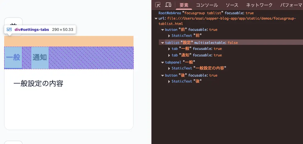
focusgroup does not override an element's existing native semantics or an explicit role. For example, <ul focusgroup="menubar"> does not automatically become a menubar; it retains its list semantics. If the list represents an application menubar, the developer must explicitly assign role="menubar" and the appropriate child roles.
inline means that only arrow keys on the inline axis trigger navigation, while block limits navigation to the block axis. In ordinary horizontal writing, inline corresponds to left and right, while block corresponds to up and down. Because these values use logical rather than fixed physical directions, they also adapt to direction: rtl and vertical writing modes.
Axis modifiers are resolved as follows:
- When both
inlineandblockare specified: navigation works on both axes - When only one is specified: navigation works only on that axis
- When neither is specified: the defaults of the behavior token apply
As a result, radiogroup, which has no default axis, supports all four arrow keys. In contrast, toolbar defaults to inline, so the Up and Down Arrow keys do not move focus. To support vertical movement as well, explicitly specify both axes, as in focusgroup="toolbar inline block".
Consider the following radiogroup example. Because the only default modifier for radiogroup is wrap, there is no axis restriction, so both the Left and Right Arrow keys and the Up and Down Arrow keys move focus.
wrap moves focus to the opposite end when navigation attempts to move past an edge. For example, with focusgroup="toolbar wrap", pressing the Right Arrow key on the last button returns focus to the first button. Toolbars do not wrap by default, so wrap is specified explicitly. In contrast, tablist and menu include wrap by default. Specify nowrap to disable wrapping.
Behavior tokens and modifier tokens are separated by spaces, and their order has no meaning. For readability, putting the behavior token first usually makes the value easier to understand.
focusgroupstart and Focus Memory
To focus a particular item the first time a user enters a focusgroup, add the focusgroupstart attribute to that item.
<button type="button">focusgroup の前</button>

<div role="toolbar" focusgroup="toolbar nomemory" aria-label="配置">
  <button type="button">左揃え</button>
  <button type="button" focusgroupstart>中央揃え</button>
  <button type="button">右揃え</button>
</div>

<button type="button">focusgroup の後</button>
In this example, entering the focusgroup from either surrounding button with Tab or Shift+Tab moves focus to the “Center align” button.
The important point is that default focus memory takes precedence over focusgroupstart. Without nomemory, the item with focusgroupstart is used on the first entry, but subsequent entries return to the last-focused item. To always start from focusgroupstart, combine it with nomemory as shown above.
Excluding Some Elements from Arrow-Key Navigation
focusgroup="none" excludes an element and its descendants from an ancestor focusgroup. In the following example, infrequently used help-related buttons are excluded from the toolbar's arrow-key navigation.
<div role="toolbar" focusgroup="toolbar wrap" aria-label="編集">
  <button type="button">元に戻す</button>
  <button type="button">やり直す</button>

  <span focusgroup="none">
    <button type="button">ヘルプ</button>
    <button type="button">ショートカット一覧</button>
  </span>

  <button type="button">保存</button>
</div>
Pressing the Right Arrow key on the “やり直す” button skips “ヘルプ” and “ショートカット一覧” and moves to “保存”. However, focusgroup="none" does not make elements inoperable. The two excluded buttons remain in normal Tab-key navigation.
Segments and Tab Stops
Excluded elements remain in Tab-key navigation because focusgroup="none" divides the focusgroup into focus group segments, referred to here as segments. A segment is not a DOM element. It is a specification concept representing a contiguous set of items that can be navigated with arrow keys without crossing an excluded element. The browser calculates Tab stops separately for each segment.
The following two cases create segment boundaries:
- An element excluded with
focusgroup="none"when it contains focusable elements - A separate nested focusgroup when it contains items
In the example above, the <span> containing “ヘルプ” and “ショートカット一覧” forms a boundary and divides the content as follows:
- Segment 1: “元に戻す”, “やり直す”
- Excluded elements: “ヘルプ”, “ショートカット一覧”
- Segment 2: “保存”
Each segment is guaranteed to have one Tab stop. Pressing Tab therefore moves focus in this order: an item in segment 1 → “Help” → “Keyboard shortcuts” → “Save” in segment 2. Because the excluded elements are not managed by the focusgroup, each remains an independent Tab stop as usual.
Arrow-key navigation, on the other hand, can cross segment boundaries. Pressing the Right Arrow key on “やり直す” in segment 1 skips the two excluded buttons and moves to “保存” in segment 2. In other words, focusgroup="none" keeps the elements in the Tab-key path while removing them only from the arrow-key path.
More segments also mean more Tab stops, so excessive use of focusgroup="none" weakens the benefit of consolidating a group into a single Tab stop. If many items need to be excluded from arrow-key navigation, consider whether they should belong to the same focusgroup in the first place.
Nesting Focusgroups
Focusgroups can be nested, as in a menubar with a submenu. A child focusgroup is implicitly excluded from its ancestor focusgroup, and each group independently manages focus navigation.
<div role="menubar" focusgroup="menubar" aria-label="アプリケーションメニュー">
  <!-- Wrap the submenu in an element with role="none" because the menubar role can only own menuitem, menuitemcheckbox, menuitemradio, and group children -->
  <div role="none">
    <button
      type="button"
      role="menuitem"
      popovertarget="file-menu"
      aria-haspopup="menu"
    >
      ファイル
    </button>

    <!-- Display the menu popup with popover. The menu is a nested focusgroup -->
    <div id="file-menu" role="menu" focusgroup="menu" popover>
      <button type="button" role="menuitem" autofocus>新規作成</button>
      <button type="button" role="menuitem">開く</button>
      <button type="button" role="menuitem">保存</button>
    </div>
  </div>

  <button type="button" role="menuitem">編集</button>
</div>
Opening the child focusgroup and moving focus from the ancestor to the child are not responsibilities of focusgroup. In this example, the Popover API's popovertarget and autofocus features handle those tasks.
Because menubar includes inline wrap by default, the Left and Right Arrow keys move between “ファイル” and “編集”. The submenu's menu uses block wrap, so after it opens, the Up and Down Arrow keys move between its items.
Developers Manage Selection State
focusgroup provides focus movement, but it does not change item selection. In a tablist, after arrow-key navigation moves focus to another tab, JavaScript must update the selected tab and the displayed tab panel.
<div id="settings-tabs" focusgroup="tablist nomemory" aria-label="設定">
  <button
    type="button"
    id="tab-general"
    aria-selected="true"
    aria-controls="panel-general"
    focusgroupstart
  >
    一般
  </button>
  <button
    type="button"
    id="tab-notification"
    aria-selected="false"
    aria-controls="panel-notification"
  >
    通知
  </button>
</div>

<div role="tabpanel" id="panel-general" aria-labelledby="tab-general" tabindex="0">
  一般設定の内容
</div>
<div
  role="tabpanel"
  id="panel-notification"
  aria-labelledby="tab-notification"
  hidden
>
  通知設定の内容
</div>
aria-* attributes are not inferred from focusgroup. Developers must specify aria-selected for tab selection state, aria-controls and aria-labelledby for the relationship between tabs and panels, and aria-label for the tablist's name. A vertical tablist must also explicitly specify aria-orientation="vertical" alongside focusgroup="tablist block".
The demo updates aria-selected, hidden, and focusgroupstart when focus moves to a tab.
const tabs = [...document.querySelectorAll("#settings-tabs > button")];

tabs.forEach((tab) => {
  tab.addEventListener("focus", () => {
    tabs.forEach((item) => {
      const selected = item === tab;
      item.setAttribute("aria-selected", String(selected));
      item.toggleAttribute("focusgroupstart", selected);

      const panel = document.getElementById(item.getAttribute("aria-controls"));
      panel.hidden = !selected;
    });
  });
});
The JavaScript updates focusgroupstart because the group has nomemory. With memory disabled, the browser looks for the item with focusgroupstart each time the user enters the group. Without moving this attribute, leaving the group with the “Notifications” tab selected and returning with Tab would always focus the first tab, “General”.
You might wonder whether default focus memory would produce the same result by returning to the last-focused tab. When selection changes together with focus, as it does in this example, the result is indeed the same. However, memory tracks the last-focused item, not the selected item. The APG tabs pattern requires the latter. For example, if JavaScript changes the selected tab while restoring state from a URL query, memory continues to point to the old focus position.
The combination of nomemory and focusgroupstart expresses this intent declaratively without relying on the secondary state of focus history.
Accessibility Semantics
The current Explainer proposes that browsers infer a minimum ARIA role based on the behavior token. For example, a <div focusgroup="tablist"> without a role is exposed as a tablist in the accessibility tree, while its child <button> elements are exposed as tab elements.
Although this child-role inference is part of the current Explainer, discussion continues over whether it should remain in the final specification, be removed from the first version, or be deferred to a future feature. The following sections present the arguments for each position.
The Case for Keeping Child-Role Inference
Supporters of child-role inference argue that providing both the interaction pattern represented by a behavior token and the minimum required semantics can reduce omitted ARIA roles. For example, on a generic container with focusgroup="tablist", child <button> elements can be exposed as tab elements. This makes it easier to build an APG-aligned accessibility tree without repeating the same role on every button. The Pull Request that extends child-role inference to
<button> elements explains that buttons are the most common building blocks for composite-widget items and that the accessibility tree exposed to screen readers remains the same regardless of which markup style is used.
However, inference does not unconditionally replace existing semantics. Under the current proposal, a child's role is inferred only when the container's role is itself inferred from the behavior token, the child has no explicit role, and inference does not destroy existing native semantics. Because <button> is commonly used to build tabs and menu items, it is an exception and remains eligible for inference. When several derived roles are possible, such as menuitemcheckbox and menuitemradio, the browser does not guess; the developer must specify the role explicitly.
Even if role inference is retained, setting focusgroup does not automate widget-specific state management. Developers still need to implement values such as aria-selected and aria-checked, labels, tab-panel relationships, and other requirements of the relevant UI pattern.
The Case for Removing or Deferring Child-Role Inference
On the other hand, some are concerned that specifying the “behavior” of focus movement implicitly changes the “meaning” exposed to assistive technologies, giving the feature too broad a responsibility. The rules the browser must evaluate also become more complex, including which elements are eligible for inference, conflicts with native elements, and mismatches between an explicit container role and the behavior token.
Because developers can specify child roles explicitly, another proposal is to provide only the container pattern and focus navigation in the first version and leave child-role inference for future consideration. This approach would first introduce the navigation feature, then measure how often roles are omitted and how much authoring burden remains before standardizing inference.
The body of the current Explainer includes child-role inference, but its Open questions section again considers removing inference from the first version or deferring it. In other words, it was not a final decision as of July 2026.
Alternatives to the Behavior Token Design
The discussion extends beyond child-role inference. The Open questions also lists the following alternatives to the design in which the
focusgroup attribute accepts a token representing a UI pattern:
- Current proposal: the behavior token controls the interaction pattern and optional child-role inference
- Require a container role: require an explicit
roleon the container and allowfocusgroupto accept only modifiers such aswrapandinline, eliminating behavior tokens - Split the attributes: separate the pattern from navigation modifiers, as in
pattern="tablist" focusgroup="wrap"; this clarifies responsibilities but adds more attributes - Rely on native elements: solve the problem with future elements such as
<tabs>and<toolbar>, making the attribute unnecessary; however, providing all those elements will take time, and custom-element-based UIs would still need a declarative navigation mechanism
For example, the issue “tablist behavior token is misleading” points out that the name
tablist suggests that activation and selection state are included, even though it is effectively only shorthand for focusgroup="inline wrap". It proposes removing most behavior tokens and limiting the values to modifiers for direction, wrapping, and memory. If the design principle that focusgroup handles only focus movement is followed to its logical conclusion, using UI-pattern names as tokens itself becomes questionable.
The set of patterns allowed as behavior tokens is also under discussion. For example, MDN recommends against using grid and listbox as composite widgets, leading to a concern that supporting them in focusgroup would itself signal that those uses are acceptable.
Two-dimensional grid navigation—moving between rows with the Up and Down Arrow keys and between columns with the Left and Right Arrow keys, as in the grid pattern—has been moved to Future Considerations because of its implementation complexity and is not part of the current proposal. UIs such as data tables and calendars still require JavaScript focus management.
Detecting Support
Browsers that support focusgroup expose a focusGroup DOM property corresponding to the HTML focusgroup attribute. You can detect support with the following code.
if ("focusGroup" in HTMLElement.prototype) {
  // focusgroup is supported
} else {
  // Use a roving tabindex implementation or polyfill
}
Summary
- The
focusgroupattribute declaratively implements arrow-key focus navigation in composite widgets - It generally consolidates a group into a single Tab stop and delegates arrow-key navigation and last-focused memory to the browser
wrapandnowrapspecify what happens at an edge, whilenomemorydisables focus memoryfocusgroupstartspecifies the initially focused item, whilefocusgroup="none"excludes some elements from arrow-key navigationfocusgrouphandles only focus movement; developers manage the selection state of tabs, radio buttons, and other items- It is available in Chrome 150, but its addition to the HTML Standard and features such as role inference remain under discussion
References
Focusgroup (Explainer) | Open UI
[focusgroup] Declarative directional focus navigation for composite widgets | WHATWG
Chrome 150 Release Notes
ARIA Authoring Practices Guide