Expose Actions Associated with an Element to Assistive Technologies with `aria-actions`
`aria-actions` associates an element with separate interactive elements that provide actions for it. This article explains the problem it solves and demonstrates its use with secondary actions in an email list.
As of August 2026, aria-actions has been proposed for inclusion in WAI-ARIA 1.3, but the specification is not yet finalized. Firefox has already shipped it, Chrome 151 supports it on Windows, macOS, and Linux, and Safari makes it available behind a flag. Behavior may still vary depending on the browser and assistive technology combination, so when using it in a production application, provide conventional keyboard interaction as a fallback and test it in each environment you intend to support.
The aria-actions attribute was proposed to help assistive technology users discover and perform secondary actions associated with an item, such as a Close button on a tab or a Delete button on an email.
Web applications often use interfaces in which a list item has actions separate from its primary action. In an email application, for example, selecting a message opens its content. Each message may also provide actions such as Mark as read, Star, and Delete. These actions often appear as icons in the same row as the sender and subject, or as buttons that become visible when the pointer hovers over the message. You have probably encountered this UI pattern before.
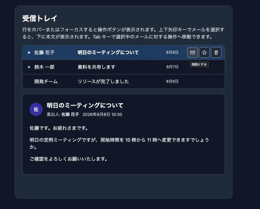
Sighted users can understand which actions are available from the icons in the same row as the message or from the buttons that appear when they hover over it. The buttons' position and appearance also indicate which message the actions apply to.
Screen reader users, on the other hand, understand the UI through the accessibility tree. When focus moves to a message item, the sender, subject, and selection state are announced. However, if the action buttons are elsewhere in the DOM, neither their existence nor their relationship to the message is conveyed. Even if users eventually discover the actions by navigating to the buttons, they might not be able to determine which message those actions affect.
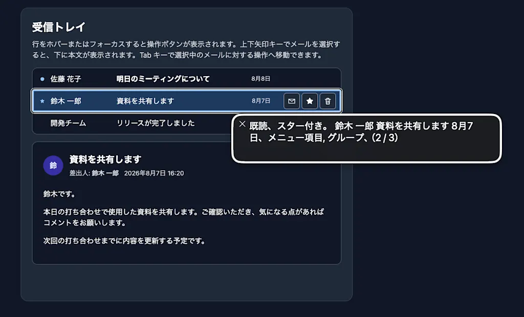
The problem, in other words, is that a relationship communicated visually through the placement of the buttons is missing from the accessibility tree.
Similar examples include closing a tab, sharing or favoriting a file in a file list, and muting a participant in an online meeting. These actions are distinguished from the primary action of selecting an item and are called secondary actions.

The Secondary actions on items in composite widget roles issue, filed in the W3C ARIA repository in March 2021, described the difficulty of expressing this UI pattern with existing ARIA. Several possible solutions were discussed in the issue, but each had drawbacks.
One approach is to place the action buttons inside an element with role="option" or role="tab". This DOM structure lets assistive technologies determine which item the buttons are associated with.
<div role="listbox" aria-label="受信トレイ">
  <div role="option" tabindex="0" aria-selected="true">
    <span>明日のミーティングについて</span>
    <button aria-label="既読にする">...</button>
    <button aria-label="スターを付ける">...</button>
    <button aria-label="削除する">...</button>
  </div>
</div>
However, role="option", which is used for listbox options, and role="tab" are among the roles that treat their descendants as presentational. For example, if you place a heading inside a
tab, the heading is treated as if it had role="presentation", so assistive technologies do not recognize it as a heading.
<div role="tablist">
  <div role="tab" aria-selected="true">
    <h2>タブ 1</h2>
  </div>
  <!-- Equivalent to the following -->
  <div role="tab">
    <h2 role="presentation">タブ 1</h2>
  </div>
</div>
For a focusable <button>, Presentational Roles Conflict Resolution requires the user agent to ignore the inherited role="presentation" and expose the button in the accessibility tree. However, nesting interactive elements inside an item in a composite widget makes focus management with the arrow keys and Tab key more complex.
Another approach has been to duplicate secondary actions in a context menu. However, the issue explains that context menus were not sufficiently discoverable and that users expected to be able to move directly to the visible buttons with the keyboard.
In short, existing ARIA provided no way to express the relationship "activating this button performs an operation on the current item." aria-actions was proposed to solve this problem by associating an item with the elements that provide its secondary actions. This article demonstrates how to use aria-actions with an email list.
What Is the aria-actions Attribute?
The aria-actions attribute contains the id values of elements that provide related actions. Its value is an ID reference list, so you can specify multiple elements by separating their IDs with spaces, just as you do with aria-labelledby and aria-describedby.
The attribute is not limited to items in composite widgets. It can be used on almost any element, excluding text-level roles such as caption, code, generic, paragraph, strong, and time. You can also use it to associate a dialog with its Close button, or a table row with the actions that apply to it.
<div role="listbox" aria-label="受信トレイ">
  <div
    id="message-1"
    role="option"
    tabindex="0"
    aria-selected="true"
    aria-actions="toggle-read toggle-star delete-message"
  >
    明日のミーティングについて
  </div>
</div>

<button id="toggle-read">既読にする</button>
<button id="toggle-star">スターを付ける</button>
<button id="delete-message">削除する</button>
This example associates the email item with role="option" with three buttons. The buttons do not need to be descendants of the email item. Even when they are elsewhere in the DOM, their IDs can express the relationship. In the Accessibility panel of Chrome DevTools, you can confirm that the three buttons are referenced by the message item's actions property.
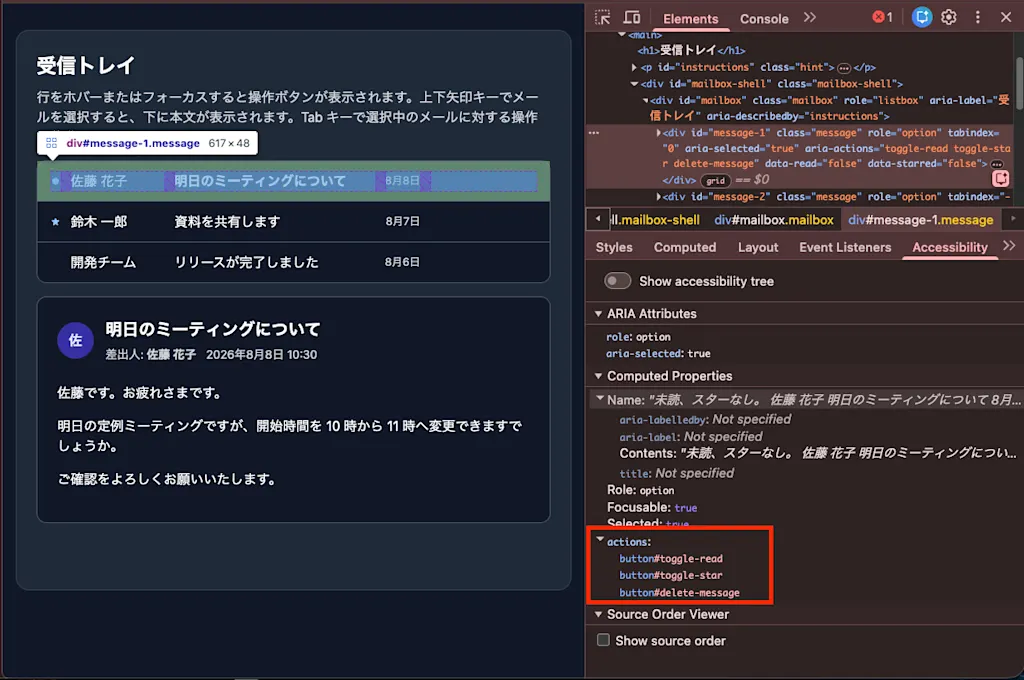
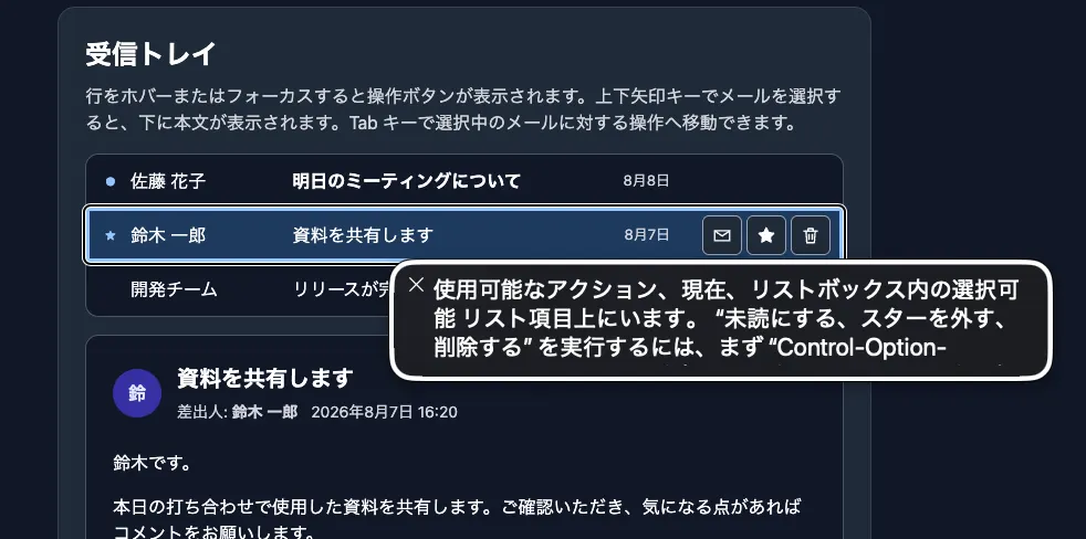
The sole purpose of aria-actions is to communicate this relationship to assistive technologies. Adding the attribute does not automatically implement click events or keyboard interaction. A supporting assistive technology can present and invoke the available actions while focus is on the email item. The handling of focus after an action is invoked is still under discussion in the specification, so do not rely on any particular behavior. Let's try it with VoiceOver on macOS. When focus moves to an email item, VoiceOver announces that an actions menu is available.
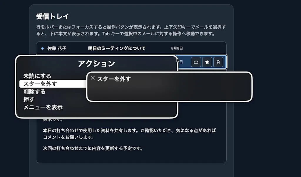
Press Ctrl + Option + Command + Space to open the actions menu. It lists the related actions: Mark as read, Star, and Delete. Selecting an action performs the same operation as clicking the referenced button.
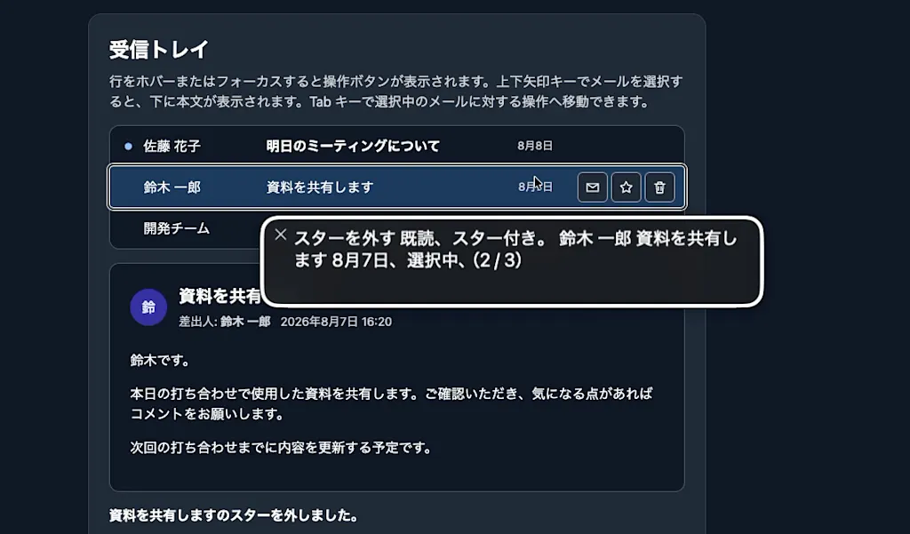
You can try the interaction in the demo below. Run it in Firefox or Chrome 151 or later.
Requirements for Referenced Elements
The aria-actions proposal defines the following requirements for elements referenced by aria-actions:
- They must have an accessible name. (MUST)
- They must respond to a
clickevent so that assistive technologies can invoke their behavior as a click on the referenced element. (MUST) - They must either be directly keyboard-navigable or provide a keyboard shortcut that can be used while focus is on the referencing element. (MUST)
- The related actions should be visible and operable while the referencing element has DOM focus. (SHOULD) The buttons should remain available on focus rather than appearing only on hover.
If the MUST requirements are not met, the user agent must not expose aria-actions to the accessibility API. Failing to meet the fourth requirement, which is a SHOULD, does not prevent exposure, but a valid attribute value is not sufficient by itself; the referenced actions must also be implemented accessibly.
A <button> Alone Is Not Enough
The third requirement is defined more concretely in the 
In other words, adding a <button> does not automatically satisfy the requirement. A composite widget such as a listbox or tablist is treated as a single tab stop, so placing a <button> with tabindex="0" inside it breaks the roving tabindex focus management the widget is supposed to provide.
Roving tabindex is a focus management technique for treating an entire composite widget as a single tab stop. Exactly one child element has tabindex="0" at any time and the rest have tabindex="-1", and the tabindex="0" moves along with the arrow key navigation. See Keyboard Interface - ARIA Authoring Practices Guide for details.
The ARIA Authoring Practices Guide example satisfies the requirement by giving each action button tabindex="-1" and including it in the same focus management as the tabs.
<div class="tab-wrapper">
  <button
    id="tab-1"
    role="tab"
    aria-selected="true"
    aria-controls="tabpanel-1"
    aria-actions="tab-1-action"
  >
    Nurse shark
  </button>
  <!-- A sibling of the tab rather than a descendant, included in arrow key focus management -->
  <button id="tab-1-action" tabindex="-1" aria-label="Actions for Nurse shark tab">
    ...
  </button>
</div>
Getting the Referenced Elements from JavaScript
You can use the ariaActionsElements property to retrieve the referenced elements from the DOM API. Running the following code in the browser's developer console returns the three buttons.
document
  .querySelector("#message-1")
  .ariaActionsElements.map((element) => element.id);
// ["toggle-read", "toggle-star", "delete-message"]
A Fallback Is Still Necessary
aria-actions is being discussed in a pull request proposing its addition to WAI-ARIA 1.3, and as of August 2026 it is not yet included in the WAI-ARIA 1.3 Working Draft, so browser implementations are ahead of the specification. The
ARIA Authoring Practices Guide example also warns that it is experimental content intended to explore a future specification and should not be used in production.
If you experiment with it today, keep the following points in mind:
- Keep the action buttons visually available.
- Make the buttons reachable either through Tab key navigation or through the composite widget's focus management.
- Implement the standard keyboard interaction for the composite widget.
- Manage action results and focus appropriately.
- Test combinations of both browsers and assistive technologies.
aria-actions should not replace existing interactions. Treat it as progressive enhancement that communicates an additional relationship between the target item and its action elements to assistive technologies.
Summary
aria-actionsis a property that associates the current element with separate interactive elements that provide related actions, using an ID reference list.- It communicates the relationship between an item in a composite widget and its secondary actions without nesting action buttons inside the item.
- Supporting assistive technologies can present a list of actions and invoke the referenced actions while focus is on the referencing element.
- Referenced elements need an accessible name, a response to
clickevents, and keyboard access. Inside a composite widget, give themtabindex="-1"and include them in its focus management. - Firefox and Chrome 151 have shipped it, but the specification is still a proposal, so keep conventional keyboard interaction as a fallback.
References
aria-actionsproperty - WAI-ARIA 1.3 proposalExperimental Example of Tabs with Action Buttons - ARIA Authoring Practices Guide
Secondary actions on items in composite widget roles - w3c/aria#1440
Intent to Ship: aria-actions - blink-dev
[aria-actions] Expose to macOS via accessibilityCustomActions - Chromium